

| What is Market Price and Market Orders? |
| What is Ask/Bid Price? |
| What are Limit Orders? |
| What are Candlesticks? |
| What is a Line chart? |
| What is an OHLC chart? |
| What are Time Frames? |
| What are Trendlines? |
| What are Support & Resistance? |
What is the Market Price?
The market price is basically the current price at which a currency can be bought or sold. This price is determined by the currency’s supply and demand. Change in either the supply side or the demand side of the currency can cause the market price for that currency to be re-evaluated. It can also be viewed as the price at which buyers and sellers agree to trade in an open market at a particular time. Market price from an accounting perspective is of considerable interest as it can be used to record the cost of certain transactions. It is also used as a comparison tool if the recorded cost of the currency is higher than its current market price. The accounting rules then may suggest reducing the recorded price of the currency to its market price or an adjusted version of the market price.
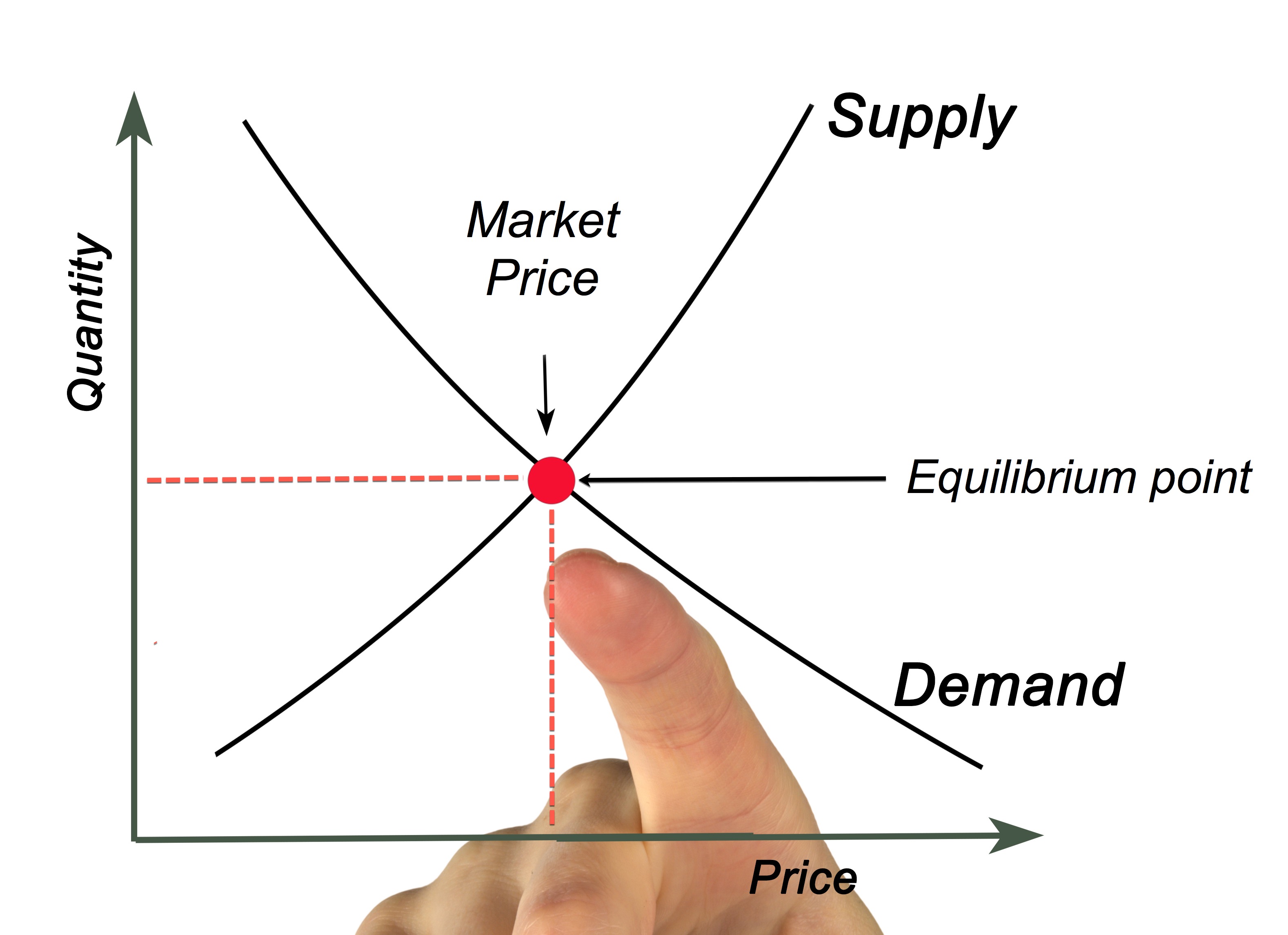
In markets like Forex, the market price of a currency changes quickly as sellers change their offer prices and buyers bid for better prices. The sellers may agree or reject the price the buyer wants to buy the currency at. Some sellers drop their offer to a lower price to match or meet the bidding price in the middle. Trade happens only if the seller agrees to the bid price or if the buyer agrees to the offer price. More about Bid & Offer Prices in the chapters below.
What are Market Orders?

A Market Order is an order to trade currency at the current market price. The trade will automatically be entered as a market order by default if the trader does not provide any additional instructions in the exchange. It is almost guaranteed that the order will be executed when using a Market Order. A Sell Market Order will generally execute somewhere near the current bid price or at the bid price. Likewise, a Buy Market Order will execute near the current ask price or at the ask price. It is essential for traders and investors to remember that a market order will not always get filled at the last traded price.
Why do Market Orders matter?
Although market orders are popular, a lot of traders and investors do not consider the risks involved. An investor using market orders will hardly get his order filled at real-time prices. When a trade uses a market order, he is basically saying that he will take any price that someone will offer. This is especially dangerous in highly volatile financial markets like Forex because an order to buy can be filled at a much higher price than originally intended to when he decided to buy. Likewise, an order to sell can be filled way below the price he was expecting to sell. An alternative to market orders is known as limit orders. Limit orders allow traders to set an exact price at which to buy or sell a currency.
What is Ask/Bid Price?

Bid Price
The highest price a trader would pay to buy a currency is known as Bid Price. This price can change very quickly as the investors and traders all over the world are bidding for it.
Ask Price
Ask price can be regarded as the smallest price at which someone is willing to sell a currency for at that moment. It is the lowest-priced sell order currently available in the market. Even ask price changes frequently as traders make moves. The Ask Price can be viewed as a reasonably good indicator of a currency’s value at a given time.
Currencies can be sold above the ask price, but should never be sold below it.
Currencies usually are bought below bid price but never above it.
The highest bid price currently being offered is the buying price of exchange. When the demand for a currency increases, the Bid price increases as well. This means the bid price is linked directly to the daily trading volume of that currency. Generally, it is preferable that the bid matches the last successful exchange sale. Buyers are free to set their bid price at their own discretion, but if the price drifts too far from the market norms, the bid price might need an adjustment to be useful.
The price at which the exchange offering is willing to sell those currencies is known as the offer price. An offer price does not include exchange or commissions fees. In the case of exchange sales, offer price is always the highest bid price. However, for peer to peer sales, the offer price may be different from the bid price.
Example: To make things clear and easy to understand, let us imagine a person is trying to buy a bike. The price for which the seller is willing to sell the bike is viewed as the Ask Price. The price at which the buyer is willing to buy the bike is considered as the bid price. Because there is no movement on the price of the bike, the Offer Price and the Ask Price is the same. If the buyer and seller agree on the Offer Price, the buyer buys the bike at that price. If not, the seller and buyer will negotiate a new Offer Price.
Understanding Ask, Bid & Offer prices as they relate to currencies will help you understand the pricing and current risk of the market. Knowing how to play according to the market is the primary step in becoming a successful investor or trader.
 Bid/Ask Spread
It is the difference in price between the Bid & Ask Prices. It represents the basic transaction cost of a trade. For instance, if the Bid Price of a currency is $1.2 & the Ask Price is $1.3, the spread is $0.1.
Bid/Ask Bounce
This term refers to a situation where the price of a currency bounces rapidly between the price ranges of Bid and Ask prices. So in situations like this, Bid Price can become the Sell price in a fraction of a second and it can come back to its original price with the same speed. By taking the above Bid/Ask Spread example, in a Bid/Ask Bounce situation, the Bid Price of a currency would be bouncing between $1.2 & $1.3 very quickly.
Last Price
The last price is basically the price at which the last transaction ultimately got filled. It can either be the price at which a buyer hoped to get the currency for or the price at which the seller wished to sell. Almost all the charts we see are based on the last price as that is the price at which transactions happens.
What are Limit Orders?
 A Limit Order is an order traders place in order to buy or sell a currency at a specific price, usually better than its current value. There are two types of limit orders, one being Buy Limit and the other being Sell Limit. A Buy Limit Order can be executed only at the limit price or a lower price. Likewise, a Sell Limit Order can only be executed at the limit price or a higher price. If a trader wants to purchase a currency pair of his desire for no more than $1, that trader can place a limit order for this exact amount and this order will only execute if the price of that currency moves to $1 or less than that.
In even simpler terms, limit orders are used to enter an order at a better price than what the market is currently offering. A buy limit is always below or equal to the current market price, while a sell limit is always above or equal to the current market price. Limit orders can be used as “set and forget”. It is not necessary to continually watch the charts when using this order. A Limit Order can just be set to buy or sell a currency, and, then, there is no need to monitor anything. If the price of the currency reaches the limit price, the trade will automatically fill.
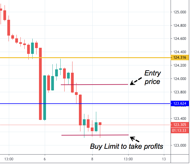
Chart 1 - Buy Limit order example. Only for illustrative purposes.
Example of a Limit Order
Let us say that Shyam wants to buy USD, but he is not willing to pay too much. The price of the USD has been extremely volatile and jumping up & down for several days within Shyam’s price range but it does not stay there. Instead of waiting for the right purchase price by watching the chats all day, Shyam can set a limit order for that price he is willing to buy. When the price reaches his buy limit price, the order will automatically execute, and Shyam can accumulate USD at his desired price.
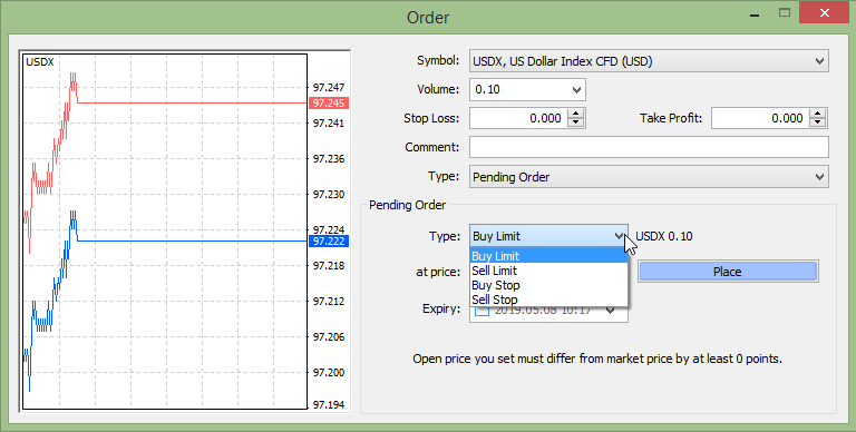
Limit Order placement
Placing a limit order is quite simple. When opening the trading window on the Trading Platform (usually MetaTrader 4), there will be an option right next to the market order for limit orders. Generally, a market order will show with the last market price filled in. To make this market order a limit order, just fill in the desired price at which the currency should be bought or sold. Once the order is confirmed, you can forget about it. Your buy or sell order will be executed when the price reaches your desired price. Not all limit orders go through. If the market price never reaches the price you wanted to, your trade will never get executed. Limit orders can also be left open with a predetermined expiration date.
While placing the limit order, make sure that you have done everything accurately. Because moving the decimal to even one place by mistake can have horrible consequences. You should also know that there are chances of your order not getting executed even if the asset does hit the limit price. That happens because limit orders work on priority basis and if there are other Limit orders in before yours for the exact same price, those will get trigger first. Also, if the supply at that particular price is not adequate to fill all of the other orders your limit order will not get triggered.
Limit Order flexibilities
You can change, stop or cancel a limit order whenever you wish to. A Limit Order can also be partially filled. If a Limit Order got triggered but the price rises even before it is completely filled, then you will receive a partial number of assets. If the partial limit order happens your limit order will remain active and the exchange will attempt to fill the remaining assets next time when the drop happens.
Stop Order
A stop order is an order to buy or sell a currency once the price of the stock reaches the specified price. This price is known as the stop price. Stop orders are commonly used to limit losses when the trader can not actively monitor the price. When the stop price is reached, a stop order becomes a market order. Stop Orders can be used, also as an entry strategy, if the trader wants to capture a price breakout of a trading range, for instance. The order will only trigger when the price reaches the level set by the trader.
Similarly to limit orders, there are two kinds of stop orders: Buy Stop and Sell Stop. A Buy Stop Order can only be issued above or equal to the current price, while a Sell Stop Order should be set below or equal to the actual price.
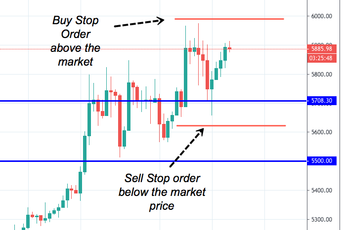
Chart 2 - Buy stop and sell stop orders example. Only for illustrative purposes.
Example: If a trader buys a currency for $5 and want to limit their loss while they exit at no less than $4, they can place a stop order at $4. This order only triggers if the price of the currency falls down to $4.
Stop Limit Order
This order is a combination of a stop order and a limit order. The limit price in this order can be as same as the stop order or can also be different. In this order type, the limit order is triggered when the price of a currency hits the stop order price.
Example: Same as the previous example, let’s say a trader enters a trade with a stop order of $4 with a limit of $3.5. The trader’s order will be triggered as soon as the price drops to $4 but will only be filled at the price of $3.5 or batter.
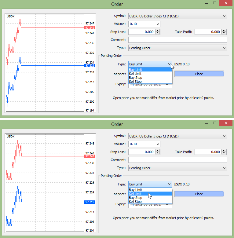
Where to place the Limit or Stop Orders
To place a limit order, choose the type as ‘Pending Order’
If you want to place a buy limit order, choose the Buy Limit and vice versa. The same procedure applies to Stop Orders.
What are Candlesticks?
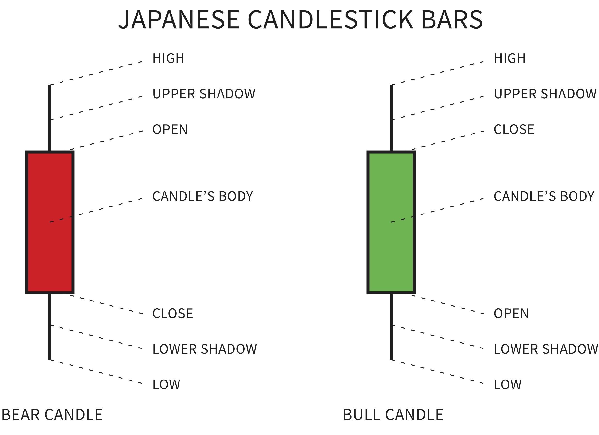
A candlestick is a chart that displays the high, low, opening and closing prices of a currency for a specific period. The wide part of the candlestick is called the “real body” and tells the distance the price has moved from open to close. A black or red candle tells that the currency has closed lower and a white or green candle indicates that it has closed higher.
Bull Market (Bullish)
A currency that has experienced a continued period of rising prices is said to be in Bull Market.
Bear Market (Bearish)
A currency that has experienced a continued period of declining prices is said to be in Bear Market.
To create a candlestick chart you should have a data set which contains open, high, low and close values for each of the time periods that you want to display. The filled portion of the candlestick is called the ‘body’ while the long thin lines above and below the body represent the high or low range which are called ‘shadows’. They are also referred to as ‘wicks’ and ‘tails’. The top of the upper shadow indicates the high, and the bottom of the lower shadow indicates the low.
If the price of a currency closes higher than its opening price, a hollow candlestick is drawn with the bottom of the body representing the opening price and the top of the body representing the closing price. Likewise, if the price of the currency closes lower than its opening price a filled candlestick is drawn with the top of the body representing the opening price and the lower side of the body representing the closing price.
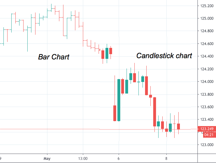
Chart 3 - Differences in visualisation of bar and candlestick charts
Compared to traditional bar charts a lot of traders prefer candlestick charts as they are more visually appealing and much easier to interpret. Each of the candlesticks provides a simple and visually appealing picture of the price action of the currency, and a trader can easily compare the relationship between the open and close along with the high and low. The relationship between the open and close is considered as valuable information and forms the basic essence of candlesticks. Hollow candlesticks where the close is larger than the open indicate buying pressure. Whereas filled candlesticks in which the close is less than the open, indicate selling pressure.
Example of a Candlestick Chart with volume
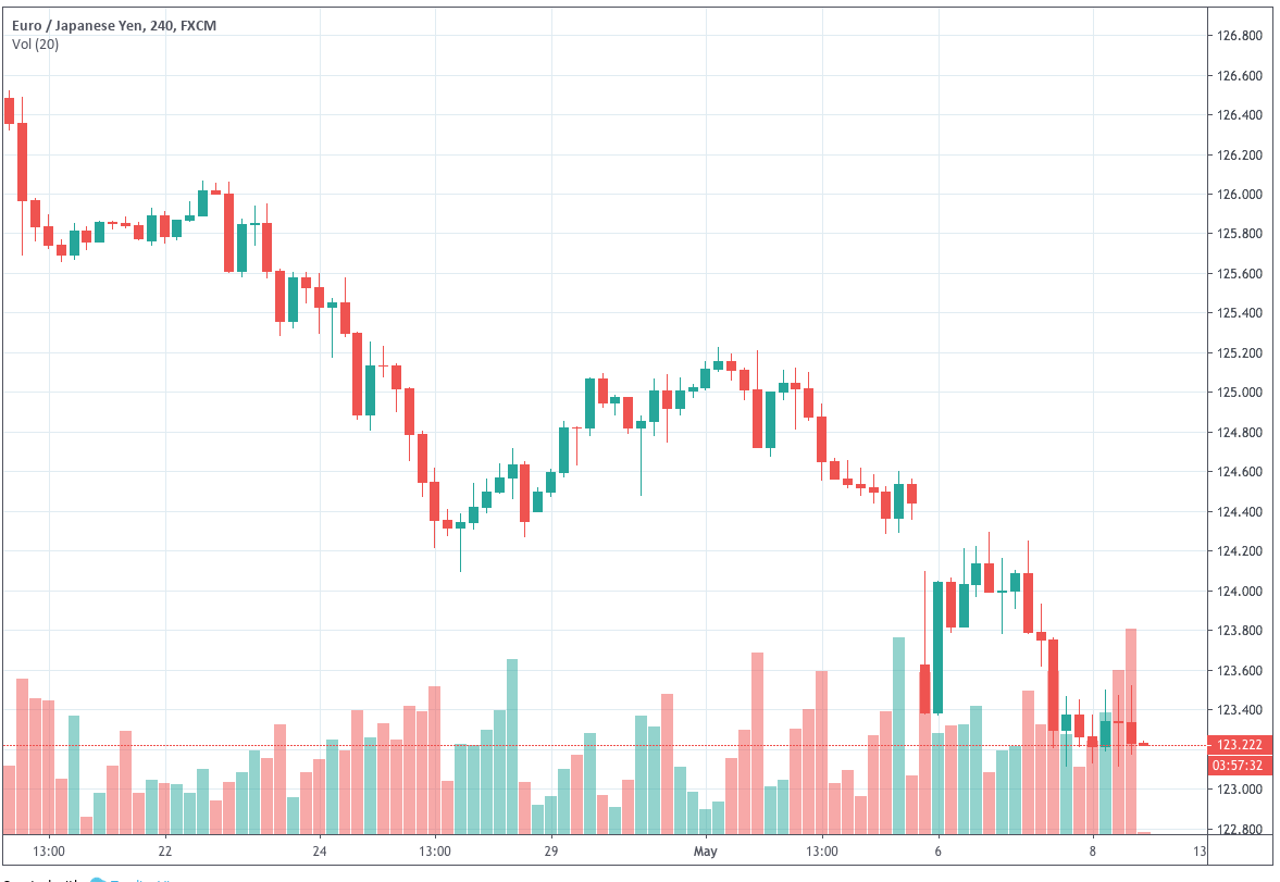
Chart 4 - EUR/JPY 4H chart with volume bars 8 (click on it to enlarge)
What is a Line chart?
A line chart basically connects a series of data points with a line and is generally used by traders to monitor closing prices. Line chat is the most basic type of chart used by linking a series of closing prices. Line charts can be used on any given timeframe. They are the most basic type of chart because they represent only the closing prices over a set of periods. The line in the line chart is formed by connecting the closing prices for each of the periods over the timeframe. However, this type of chart does not provide much insight over the intraday price movements as it only contains the closing prices of a currency. Many traders & investors prefer using Line chart as they consider closing price more important than the open, high, or low price within a given time period. These charts are essentially used to spot trends since there is less to no noise at all happening in these charts compared to other chart types.
A Line chart is also known as close-only chart as it plots only the closing price of the underlying currency, with a line connecting the dots formed by only the close price. In any given line chart the price data for the underlying currency is plotted on a graph with the time plotted along the x-axis, and price levels are plotted along the y-axis. The simplicity of the line chart is its secret sauce as it provides a clean, uncluttered, visual display of the price movement. This makes line chart an ideal tool for use in identifying the support and resistance levels, trend lines, and chart patterns.
Pros of the Line Chart
A Line Chart is very basic and straightforward. It is very easy to understand even for beginners as these charts do not have any traps or pitfalls.
Line Chart’s method of representing price action enables a trader to illustrate support and resistance levels and identify patterns.
Cons of the Line Chart
Line charts do not contain complete information. It gives less information to the traders compared to the other charts. For instance, in line charts, you will see currency prices for the previous time intervals on the daily timeframe but you will not know what happened during the course of each day. Also, Line charts do not show price gaps as there will be a line between the closing price on Friday and opening price on Monday.
What is an OHLC chart?
Open-High-Low-Close Charts or OHLC Charts are used as a trading tool by pro Forex traders to visualize & analyze the price changes over time for currencies. OHLC Charts are mostly useful for interpreting the day to day sentiment of the market and for forecasting any future price changes through the patterns produced.
 Chart 5 - An OHLC Chart dissection
The y-axis on an OHLC Chart is used for the price scale, while the x-axis is used for the time scale. On a given period, For example in a day, an OHLC bar plots a symbol that represents two ranges, the first range being between the highest and lowest price traded in that time, and the other range between the opening and closing price in that period. On the bar, the high & low price ranges are denoted by the length of the main vertical line. The open and close prices are indicated by the vertical positioning of tick-marks that appear on the left which represents the Open price and on the right which represents the Close price sides of the high-low vertical line.
A colour can be assigned to each of the OHLC Chart symbols to differentiate between the bullish and bearish markets. The market is bullish when the Close is higher than its Open and bearish when the Closing price is lower than the Open. Each data point in the OHLC charts is represented as a vertical line.
OHLC charts are important because they can show an increase or decrease in the momentum. When the open and close are far apart from each other, it expresses strong momentum. Contrarily, when the open and close are close to each other, it denotes weak momentum. The high and low in the chart indicate the complete price range of the period which will be useful in assessing volatility. There are several other patterns traders analyze using OHLC charts. Some of the major patterns include the key reversal, outside bar, and the inside bar.
There are a lot of different insights that technical analysts derive from the OHLC charts. The vertical height, horizontal line position, Bar colour, and patterns are the important components of the OHLC chart, and each of them has its own significance. Candlestick charts and OHLC charts show exactly the same data, but OHLC charts have a very clear advantage over the candlestick charts. The bars in these charts do not require colour or fill pattern to show the open and close levels as that part is taken care of by the horizontal line positions. Hence these charts are less confusing compared to the candlestick charts.
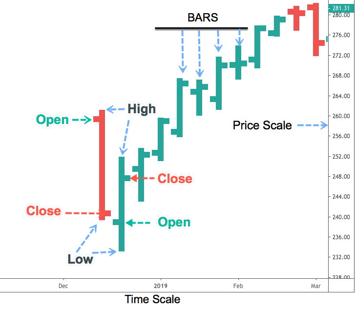
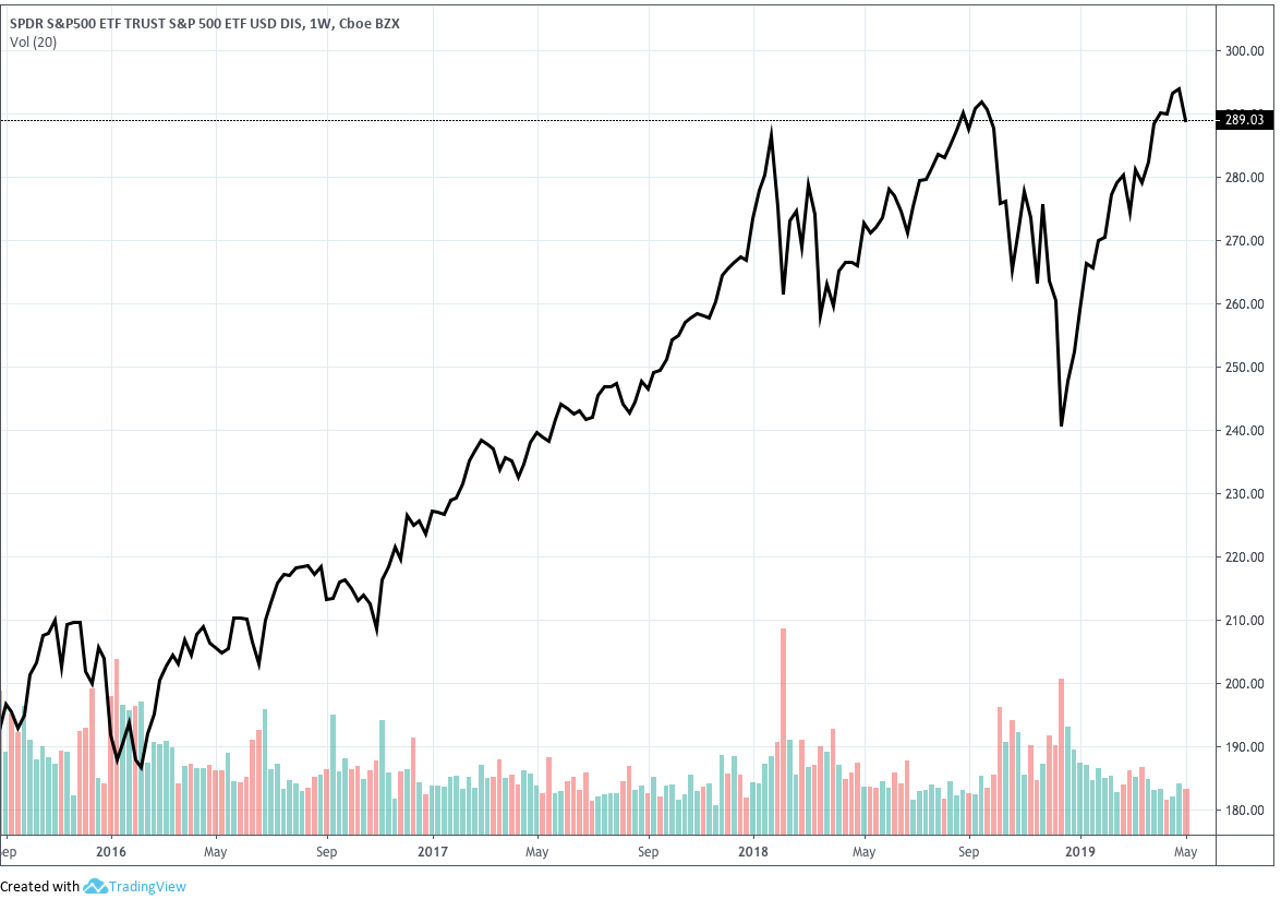
Chart 6 - Example of an OHLC chart - SPY OHLC Weekly Chart
What are Time Frames?
Time frame refers to the period that a Forex trader prefers to trade. The time frames in the Forex market involve minutes, hours, days or months. Traders use diverse time frames to analyze and track a trade, or they may just stick to one according to their preference.
When you place a trade, irrespective of what time frame you choose, the results will be similar. If you enter a buy trade in forex market and give you stop loss and take profit values, you can trade with those details in any time frame and the outcomes will be the same. So, what is the purpose of different time frames?
Different time frames are necessary only when you have to do technical analysis. Traders analyze price action of a currency in different time frames as they may give them a different picture of the market. It is like zooming in and out of the map. For instance, if you want to see accurately the changes that are happening in the market while you trade, you may want to look at a 1 min or 5 min chart.
Selecting the time frame to analyze the market is very significant to define what kind of trader you are:
Scalper: Scalpers struggle to make money on very minor price changes, so their primary focus is on lower time frames like 1 or 5 minutes.
Day-trader: Day-traders try to capitalize on intraday movements. Most likely the best time frames for this activity are 15 mins - 1 hour - 4 hours.
Investor: Investors get their profit in the long term. They want to analyze daily and weekly or even monthly charts.
Timeframes can also be classified as Short-term, Mid-term and Long-term, ranging from 1 minute to monthly. Below, the usual time frames shown on an MT4 platform:
Short Term timeframes are:
- M1 – The price moves in 1-minute intervals
- M5 – The price moves in 5-minute intervals
- M15 – The price moves in 15-minute intervals
Mid Term timeframes are:
- H1 – The price moves 1-hour intervals
- H4 – The price moves in 4-hour intervals
- D1 – The price moves in 1 daily intervals
Long Term timeframes are:
- W1 – The price show weekly changes
- MN – The price show monthly changes
Market timeframes are represented by candlesticks on a market chart. Each of the candlestick represents the market activity for that period. For example, if you consider the M1 chart, every candlestick displayed depicts the price range of the market for just 1 minute. Different timeframes contain different records and can have different meanings to market traders.
As you try to analyze the market charts, you will be able to notice a difference in charts on different time frames. For example, M1 timeframe chart may give a sell signal, and while looking at M5 it is a different story. It is usual for markets to behave in such a manner. Traders entering the market at different times might have different opinions about the market.
Short time frames are usually known to have more trade signals, but most of them are false signals when compared to longer duration time frames. So how can someone avoid the false signals? By the use of multiple time frame analysis.
Multiple timeframes:
When trading using multiple timeframe analysis, you simply compare price movements of the same currency pair on different timeframes. Look at shorter timeframes in relation to the longer timeframes and only enter a trade when the shorter time frame is in agreement with the longer timeframe. Since currency pair moving across different chart time frames at the same time such as H1, D1, M1, W1, it means traders might not have the same opinion about the market and the price action of a currency at different times periods.
Trading in the direction of the longer trend increases your chances of entering trades with a higher probability of success. As a matter of fact, a trader aims at increasing more chances to his side and increasing the success rate of the trade. To make your trades successful, first, you need to establish the direction of trade using the larger time frame. Once you have established a trend you can then cross check if the shorter time frame charts and the longer time frame are in alignment. If they are, your chances of succeeding in the trade increases. This happens because the longer timeframe gives you an overview of the market direction and helps you to recognize any major price levels such as support and resistance levels and price highs and lows. This is one of the proven best practices followed by Forex traders all over the world.
Concept explaining Multiple TF’s:
Below Image is a 1D time frame and looking at the arrow mark (1D candle) let us see how that candle is segregated into smaller candles on the Lower TF (4H).
1D Time Frame
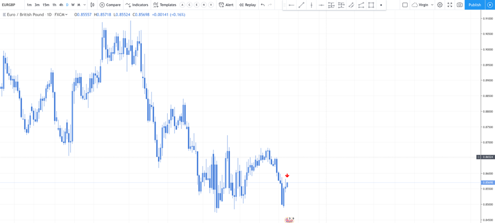
Chart 7 - Daily Timeframe. Created using TradingView.com (click to enlarge)
4H Time Frame
Below Image is the 4H chart and 1D candle is segregated into six 4H candles to represent 1D candle. So, by looking at this chart, the analysis will change, and also the story will change. Hence the universe above and below is different and looking at the below TF is important.
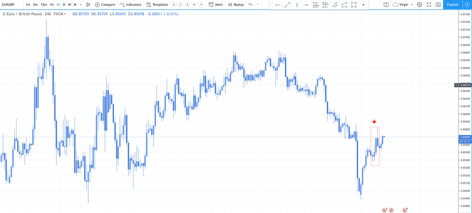
Chart 8 - 4-hour Timeframe. Created using Tradingview.com
What are Trend lines?
Trend line is essentially a straight line that connects two or more price points and then extends into the future. It acts as a line of support or resistance when extended into the future. Most of the principles which are applicable to support and resistance levels can also be applied to trend lines as well.
It is one of the most commonly used tools by traders. Trend lines can be drawn by picking up at least three previous low highs for an uptrend line and higher lows for a downtrend line. It is used to identify the route of the entire trend. Trend lines are generally used by the traders to determine the direction of the trend. Which in turn helps them in understanding the market and the trend direction.
Uptrend Line
An uptrend line has a positive slope which is formed by connecting two or more low points. The second low in the uptrend line must be higher than the first for the line to have a positive slope. At least three points must be connected for the line to be considered as a valid trend line.
Uptrend lines act as support and indicate that the net-demand is increasing even as the price rises. A rising price combined with the increasing demand is very bullish and shows a strong determination on the buyer side. As long as the prices remain above the trend line, the uptrend is considered solid. A break below the uptrend line indicates that the net-demand has weakened over time and a change in trend could be forthcoming.
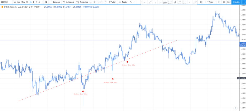
Chart 9 - Uptrend Line(Click to Enlarge)
Downtrend Line
A downtrend line is reciprocal to uptrend line. It has a negative slope and is essentially formed by connecting two or more high points. The second high should be lower than the first for the line to have a negative slope. At least three points must be connected for the line to be considered as a valid trend line. Downtrend lines act as the resistance and indicate that net-supply is increasing even as the price continues to decline. A price that is declining combined with increasing supply is very bearish and shows the strong firmness of the sellers. As long as the prices remain below the downtrend line, the downtrend is solid and intact. A break above the downtrend line indicates that the net-supply is decreasing and that a change of trend could be forthcoming. Trend lines can offer great insight, but, if misused, can also produce false signals. Other items - such as horizontal support and resistance levels or peak-and-trough analysis - should be employed to validate trend line breaks.
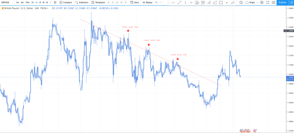
Chart 10 - Downtrend Line (Click to Enlarge)
How to draw a trend line?
First, you will need to recognize the directions of the trend. The trading platform provides a trade line. It is represented as a small slanting line on top in the chart. Select the tool. For an uptrend line connect the line from the low of one wave to the next higher low and then extend it out to the right to deliver a projection of where the next lows could perhaps occur. For a downtrend line, connect the high of one price wave to the lower high of the next price wave and then outspread it out to the right. The lines offer a projection for where future wave highs which may possibly occur. Trend lines are very important as they work as support and resistance on the forex market chart. The higher the number of times the price retests on a trend line the stronger it becomes.
There are some very important points to be considered while you trade using trend lines.
Trend lines can be used as support and resistances which helps to identify signals to trade. They are drawn at an angle and used to determine a trend and to detect signals to trade. To draw a trend line, at least two points are needed, on a downward trendline two highs must be linked by a line and for upward trendlines two lows must be connected and at least three points to make it effective. The upward trendline should be drawn below the price movement on an uptrend, and the downtrend line above the price on a downtrend line. Traders must not try to force fit the trend line on the chart. It eventually becomes invalid.
What are Support & Resistance?
Support
A support level is where the price tends to find its support (buyers) as the price falls. This means the price is more likely to bounce off this level than break through it. However, once the price successfully breaches this level, it is likely to continue falling until it meets another support level. As the name suggests, support is something that prevents the price from falling further. Supports are price points on the chart where the trader expects a maximum amount of buying demand coming in. Support levels are always below the current market price. There is a high likelihood that the price could decline until a support level, then, consolidate, absorb all the demand and then start moving upwards. The support is one of the most critical technical level market participants look for in a falling market. The support mostly acts as a trigger to buy.
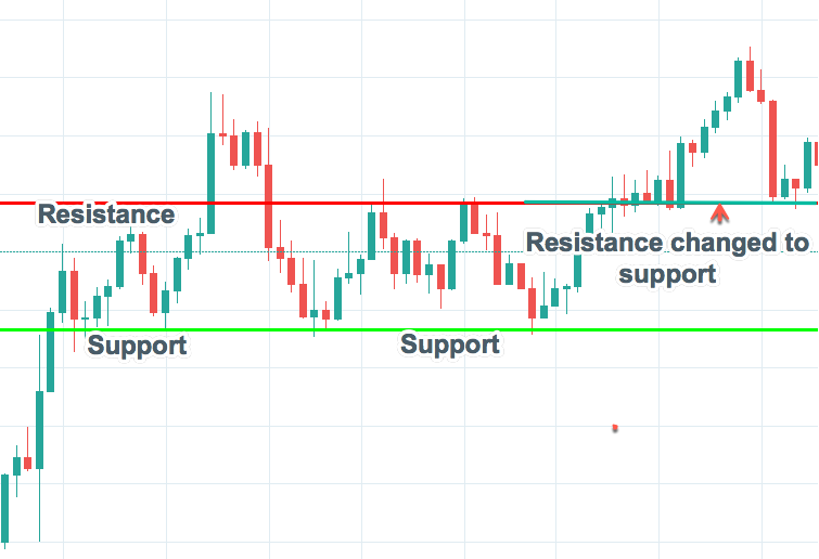
Chart 11 - Support and Resistance
Resistance
A Resistance level is the exact opposite of a Support level. Resistance is where the price tends to find resistance to further increases as it rises. This means the price is more likely to bounce off this level rather than break through it. But once the price has breached this level and gone above exceeding some noise, it is more likely to continue rising until meeting another resistance level. As the name suggests resistance is something which stops the price from rising further. The resistance level is a price point on the chart where traders expect maximum selling supply. The resistance level is always above the current market price. The likelihood of the price rising up to the resistance level, consolidating, absorbing all the supply and then declining is high. The resistance is one of the most critical technical analysis tools which market participants and Forex traders look at in a rising market. The resistance mostly acts as a trigger to sell.
Psychology plays an important role as traders and investors remember the past and react to changing conditions to anticipate future market movement in these areas of Support and Resistance.
All charts were taken from Tradingview.com and adapted to the needs of this guide.
