

Table Of Content
Overlays & Definitions
1 What is Technical Analysis?
1.1 Types of Indicators & Oscillators
2 Lagging Indicators
2.1
Moving Averages
2.2
Bollinger Bands
3 Leading Indicators
3.1
Parabolic Stop & Reverse
3.2
Average True Range
4 Oscillators
4.1
Moving Average Convergence/Divergence
4.2
Relative Strength Indicator
4.3 Commodity Channel Index
4.4 Volume
Overlays & Definitions
Resistance - Price level which acts as a ceiling above price
Support - Price level which acts as a floor below the price
Trend line - Sloping line which is described by a minimum of two peaks or troughs
Channel - Pair of parallel trend lines
Moving average - We can consider this as a dynamic trend-line. It is an impulse response filter which can be used to analyse a set of data points by forming a series of averages of different subsets in a complete data set
Bollinger bands - It is a range of price volatility
Parabolic SAR – It is a trailing stop based on prices which are tending to stay within a parabolic curvature during a strong trend
Pivot point - It is derived by calculating the average of a particular security’s high, low and closing prices
What is Technical Analysis?
By definition, TA is a tool that traders use to forecast the price action by analysing and understanding the past price action. Price and Volume are the key elements that are considered by traders to perform technical analysis for any security. Be it Fiat Currencies, Stocks, or even Cryptocurrencies, Technical Analysis is universal and can be applied for any possible security.
Technical Analysis includes a lot of other aspects such as behavioural, economic, and quantitative analysis. There are two types of Technical Analysis. The first type of Technical Analysis is done by relying just on previous price action & the psychological aspects, whereas the other being more robust. For the second type of Technical Analysis traders use indicators and oscillators above the price action, which are successfully tried and tested by the traders all over the globe.
A vast majority of the trading community believes strongly & rely on Technical Analysis. They think that the external factors such as economic, fundamentals and news events will have a very mild impact on the price action and believe in trends, conditions, and patterns. Hence, they widely use these oscillators and indicators to judge the trends.
Types of Indicators & Oscillators
Leading Indicators
These indicators help us in identifying the breakouts and breakdowns when the price action is towards sideways or non-trending. Leading indicators precede price action and forecast the price.
Lagging Indicators
This is more of a confirmation tool. Lagging indicators help us in confirming if the trend is still there holding up or weakening. These indicators follow the price action, unlike leading indicators.
Oscillator
One of the most common types of technical indicators is Oscillator. They are generally range-bound. What that means is that an oscillator can range from a low of 0 and a high of 100. Here 0 represents oversold conditions whereas, 100 represents overbought conditions.
Non-bounded
These indicators are hardly used but they still help in showing the strength or weakness of a particular trend. They also help us in identifying buy and sell signals.
Lagging Indicators
Moving Averages
The Moving average is the most basic indicator. They show where the price is moving and what may turn out to be a support or resistance in the future, which can be used for reference. They can serve as support and resistance.
A moving average is constructed by finding the average closing prices of a security over a period at a given time and then plotting these points on the price chart. The result gives you an easy line that follows the price movement of a currency pair. You can modify the smoothness of a moving average by changing its period. Moving averages computed using smaller time frames are more volatile. Similarly, moving averages plotted using larger periods and less volatile.
Simple moving average
A Simple Moving Average can be found by calculating the average (mean) price of an instrument over a given set of periods. While it is feasible to create moving averages from the Open, the High and the Low data points, most moving averages are created using the closing price. For example, a 10-day moving average is computed by adding the closing prices for the last ten days and dividing the result by 10. The calculation is repeated for subsequent data for each price on the chart. The averages are then joined together to form a smooth curving line: The Moving Average line.
Exponential Moving Average
EMA’S were devised to try to reduce the lag between the price action and the Moving Average response, by applying more weight on recent prices relative to older prices. The weighting applied to the most recent price depends on the specified period of a moving average. The shorter in length, the EMA’s period, the more weight will be applied to the most recent price.
EMA (current)= ((Price (Current) - EMA (prev)) x Multiplier) + EMA(Prev)
Uses of a Moving Average
Moving average helps in cutting down the inherent ‘noise’ of the price movement. Looking at the direction of the moving average will give us a basic idea about which way the price is moving. A moving average sometimes can act as support or resistance. In a downtrend, a moving average may form a resistance level. This is because the average creates a sort of ceiling, so the price drops off of it. In an uptrend, a moving average may act as support, the price hits the level and then starts to bounce again.
Example Buy (Simple Moving Average)
A moving average acting as a support level in an uptrend, as shown in the figure below.
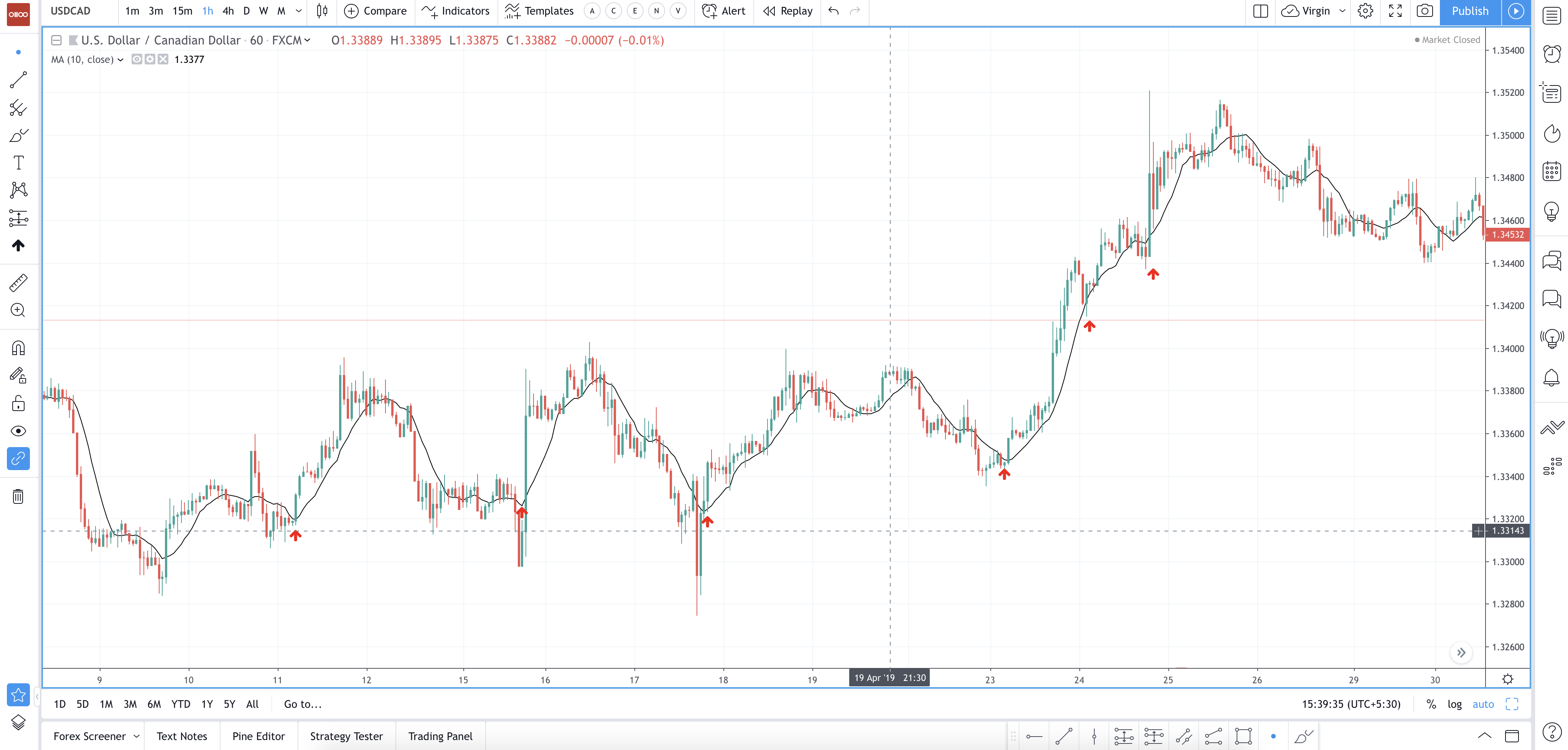
Chart 1 - Simple Moving Average buy signals on a USDCAD 1h - Click on the image to enlarge - Courtesy: tradingview.com
Example Sell (Simple Moving Average)
A moving average acting as a resistance level in a downtrend, as shown in the figure below.
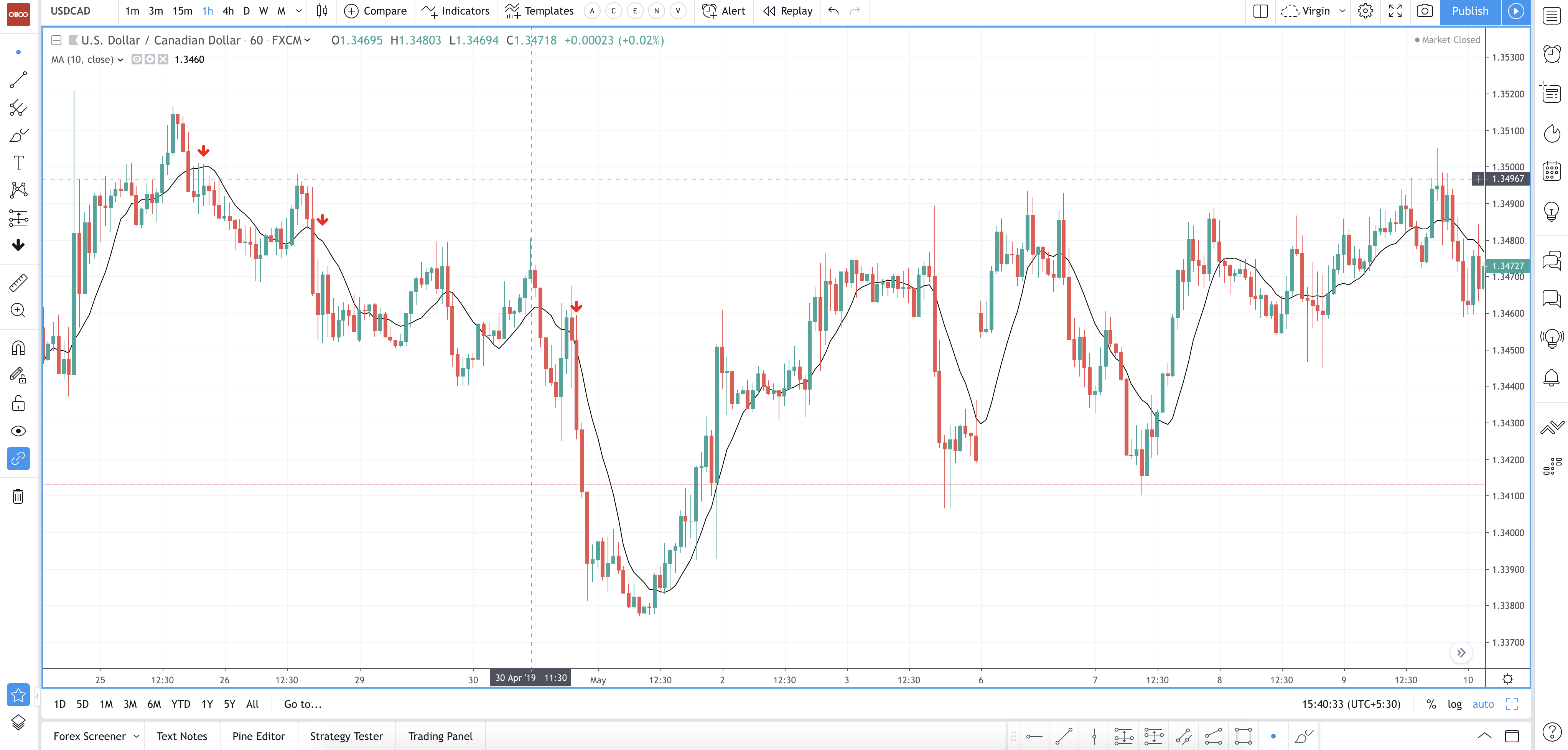
Chart 2 - Simple Moving Average Sell signals on a USDCAD 1h - Click on the image to enlarge - Courtesy: tradingview.com
The Bottom Line/When to Buy/Sell:
The price not necessarily will respect the moving average in a predefined way. Sometimes prices may break through it slightly or stop and reverse even before arriving there.
As a general case, if the price is above a moving average, the trend is said to be up (You can buy the asset when the MA is below the price). If the price is holding below a moving average, the trend is down (You can sell it when the MA is above the price).
Different moving averages can be created using varying lengths. You can change your desired length depending on the Time Frame you are using or its purpose. The Average represents the consensus of the price for the period of the indicator. Therefore, the comparison between a short-term MA and a long-term MA ( with a longer period) can detect new changes in the sentiment of the traders compared to the longer and older opinion represented by the long-term MA.
Bollinger Bands
Bollinger bands can show you not only which direction an asset is heading to but also how fraught is its price movement. Bollinger bands consist of two bands—an upper band and a lower band—and a central moving average curve. These three curves are usually plotted on top of the price movement of a chart.
How to calculate a conventional Bollinger Bands?
Bullinger bands have two parameters: period and Standard Deviation. You can create different versions of this technical study modifying each of these two parameters. But the conventional Bollinger band is made as follows:
Middle Band = 20-day simple moving average (SMA).
Upper Band = 20-day SMA + (20-day Standard Deviation of price x 2).
Lower Band = 20-day SMA – (20-day Standard Deviation of price x 2).
Upper Band and Lower Band
The use of Bollinger Bands widely varies among traders. Few traders buy when price touches the lower Bollinger Band. They exit when the price reaches the moving average in the centre of the bands. This is a good strategy when the price moves around a mean value (mean-reverting markets).
Some traders buy when the price breaks above the upper Bollinger Band and sell when the price falls below the lower Bollinger Band. This is the usual way to apply it when the trader wants to catch a trend (trend following).
When the bands lie close together, for a certain duration of time, low volatility in currency price is indicated. This occurs when the price is consolidating or retracing a previous trend. When the bands spread apart, it shows a rise in volatility and, possibly, a new trend development.
Example Buy and Sell (Bollinger Bands)
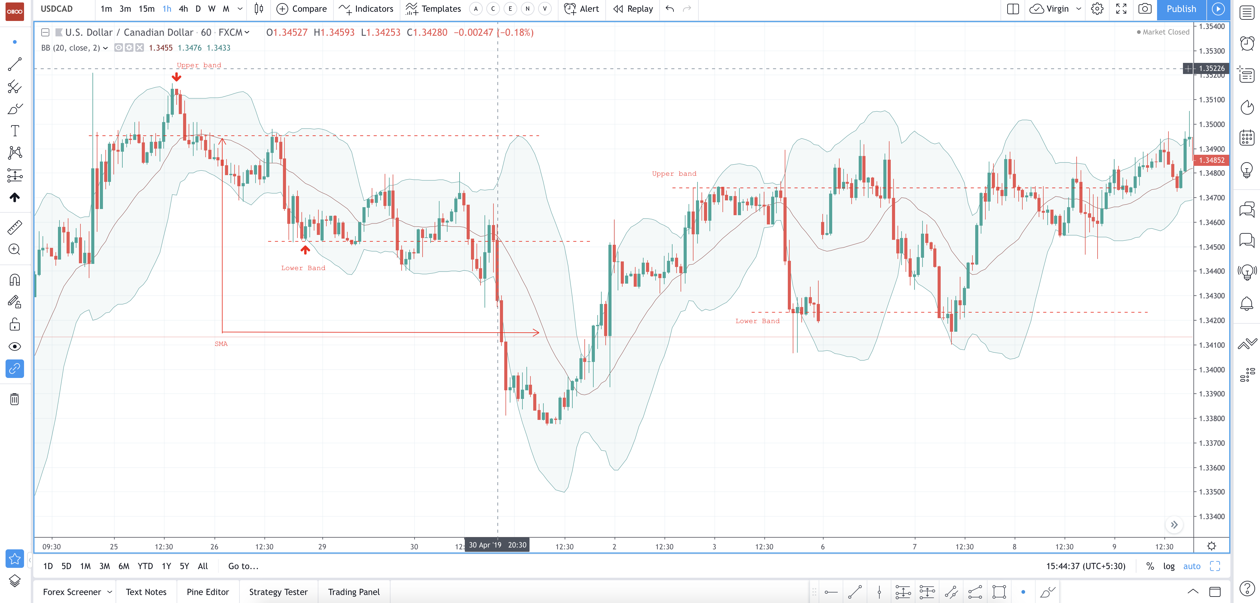
Chart 3 - Buy and Sell signals with Bollinger Bands on a USDCAD 1h - Click on the image to enlarge - Courtesy: tradingview.com
The Bottom Line/When to Buy/Sell:
The primary purpose of Bollinger Bands is to provide a relative definition of high and low. A price is high at the upper band and is low at the lower band.
Traders often combine Bollinger Bands with other indicators to see if there is a confirmation. It is often coupled with a non-oscillator indicator like trend lines. If the trend lines backs the recommendation of the Bollinger Bands, the trader will have stronger evidence that the band’s forecast is correct.
Simply put, you can buy the asset when the price touches the lower Bollinger band, and you can sell it when the price touches the upper Bollinger band.
Leading Indicators
PSAR (Parabolic Stop and Reverse)
Parabolic Stop and Reverse find trends in market prices and securities. It can be used as a trailing stop loss based on prices tending move within a parabolic curve during a strong trend. The concept is drawn on the idea of the time being the enemy. Unless a security (Either currencies, stocks or cryptos) continues to generate more profits over time, it should be liquidated.
The indicator works well in trending markets but creates whipsaws during non-trending or sideways phases. It is recommended to establish the strength and direction of the trend by using things like the Average Directional Index and then use the Parabolic SAR to trade that trend for stronger confirmations.
How to calculate the parabolic indicator?
It is calculated independently for each trend in the price. When the price moves upwards, the SAR appears below the price and converges towards it. When the price is on a downtrend, the SAR appears above the price and converges downwards. The SAR is calculated ahead of time at each step within a trend. That means the next bar’s SAR value is built using data available in the current bar.
On a daily chart, If tomorrow’s SAR value lies somewhere within today’s or yesterday’s range, the closest price should be assigned as the SAR value. In a bullish trend, the new SAR value is computed, and if it is higher than today’s or yesterday’s Low, the SAR must be made equal to that lower boundary. If tomorrow’s SAR value lies within tomorrow’s price range, a new trend direction is then signalled and the SAR must “switch sides.”
Example Uptrend:
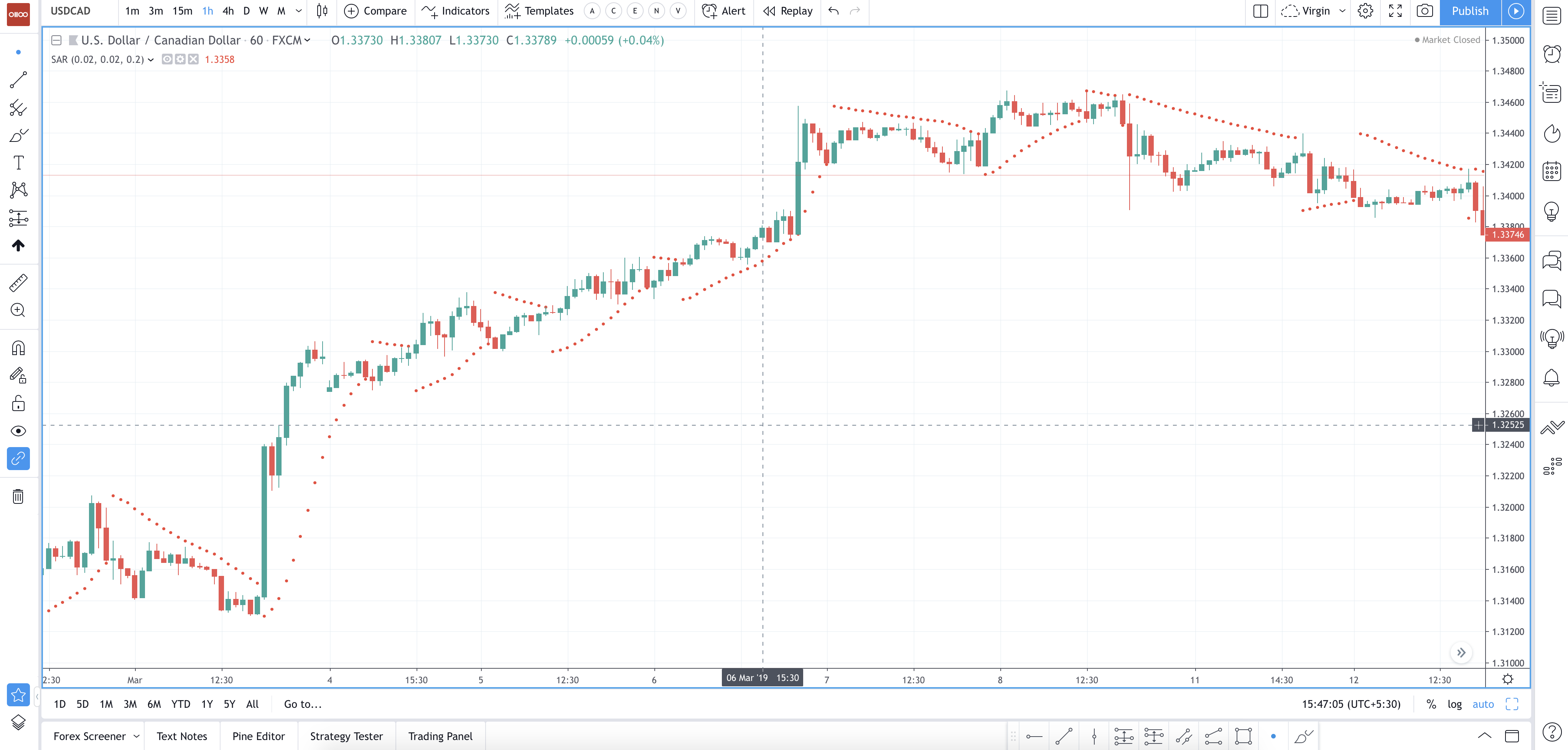
Chart 4 - PSAR uptrend on a USDCAD 1h - Click on the image to enlarge - Courtesy: tradingview.com
Example Downtrend:
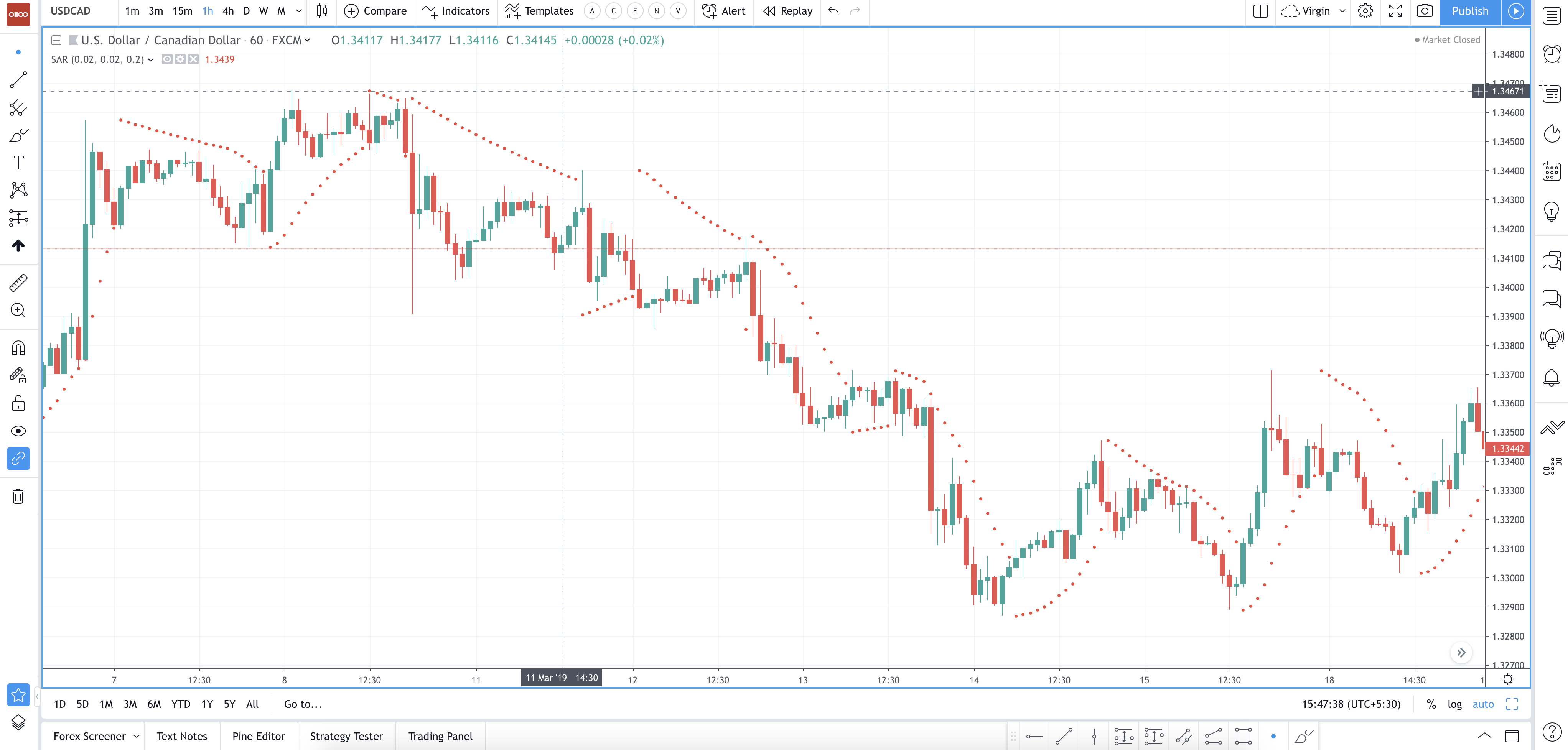
Chart 5 - PSAR downtrend on a USDCAD 1h - Click on the image to enlarge - Courtesy: tradingview.com
A parabola below the price is usually bullish, while a parabola above is generally bearish.
The Bottom Line/When to Buy/Sell:
- SAR follows the price and can be considered as an indicator that follows the trend.
- SAR follows prices like a trailing stop once a downtrend reverses and starts up. The stop continuously raised as long as the uptrend remains in place.
- SAR never decreases in an uptrend. It continuously protects profits as prices advance.
- Once the price stops rising & reverses below SAR, downtrend starts & SAR is above the price.
- SAR follows prices lower similar to a trailing stop.
Average True Range
The average true range technical indicator used to show the haphazardness of the market. The average True Range is an average of the True Range of the price action for a period.
The Range measures the range of prices on a bar. If the bar is daily, it shows the price variability of the day. If it is an hourly bar, it presents the variability of that hour. The True Range measurement takes into consideration the most current period high/low ranges as well as the previous period close as well. It takes three major calculations, and then suitable comparisons are carried out to find the right figure.
The True Range is the largest number of the following calculations:
1. The Actual Period High minus (-) Current Period Low
2. The Absolute Value (abs) of the Present Period High minus (-) The Previous Period Close
3. The Absolute Value (abs) of the Present Period Low minus (-) The Previous Period Close
True Range =max [(high - low), abs(high - previous close), abs(low - previous close)
KEY: (ABS) Absolute value is necessary because the ATR does not use price movement, only the volatility. Hence, negative numbers are not allowed.
Once you have created the True Range, the Average True Range can be plotted. The ATR is a Moving Average of the True Range, usually, over a 14-bar period.,
Major use of ATR
ATR helps in understanding the strength of the trend. It rises with the strengthening of the trend and falls when it weakens. ATR can help us in judging the movement that is left in the trend. ATR can also be used to judge the placement of Stop Loss and Take profit areas.
Examples of ATR (Buy):
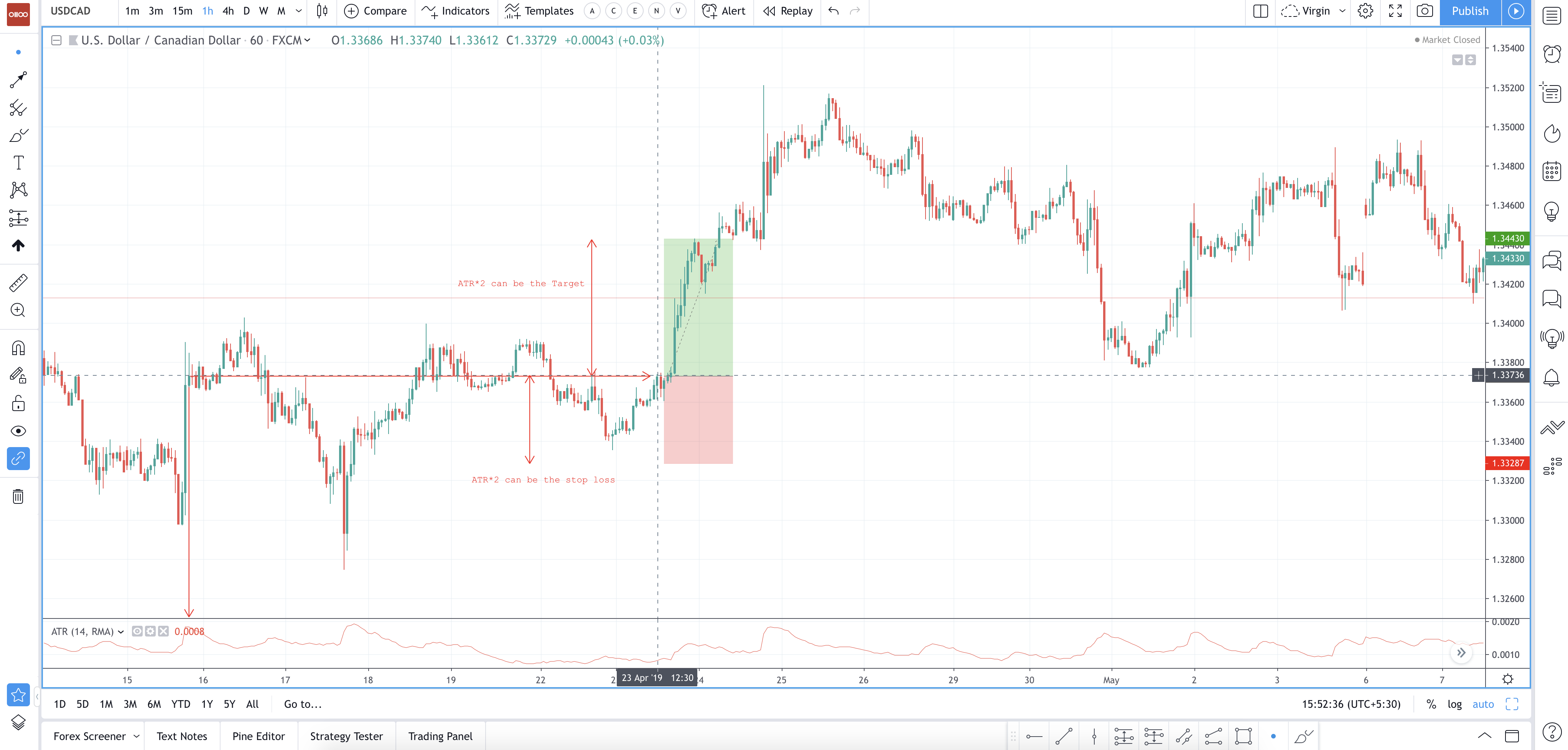
Chart 6 - ATR Buy signal on a USDCAD 1h Chart.- Click on the image to enlarge - Courtesy: tradingview.com
Examples of ATR (Sell):
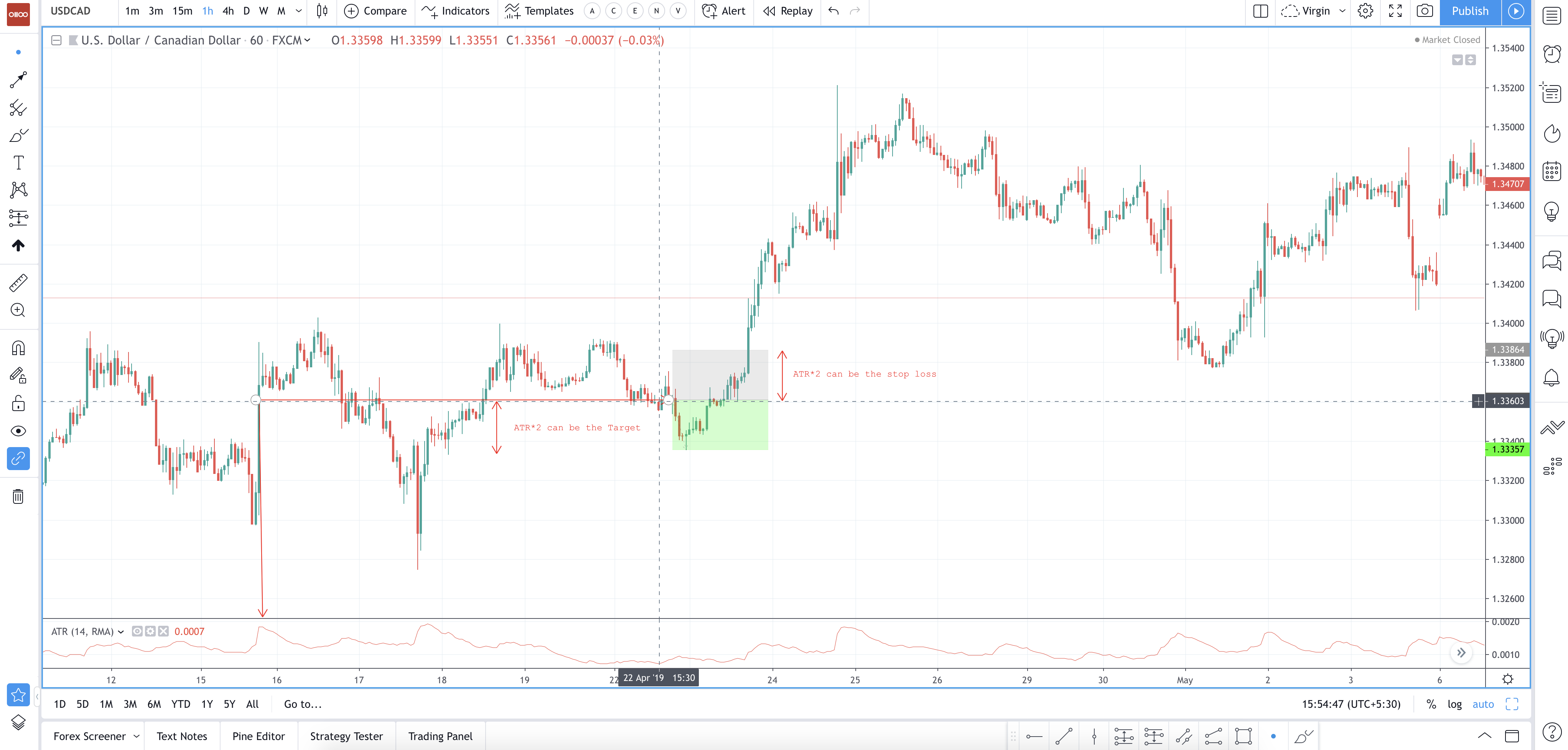
Chart 7 - ATR Sell signal on a USDCAD 1h Chart. - Click on the image to enlarge - Courtesy: tradingview.com
The Bottom Line/When to Buy/Sell:
ATR is just a number. What it basically does is to calculate the average price movement from the past 14 candles and gives us a figure. Based on that figure, we should speculate how many pips/dollars can price move in both directions. 1*ATR is preferred for target and stop loss.
Traders generally use shorter periods to generate more trading signals. Longer periods have a higher probability of generating less trading signals. For example, if a short-term trader only wishes to analyse the volatility of USD over a period of five trading days, the trader can calculate the five-day ATR.
ATR should be used to spot the Target area and the stop loss area, based on your entry.
Oscillators
MACD (Moving Average Convergence/Divergence)
The moving average convergence divergence (MACD) is known to be an oscillating indicator that can help us in determining how and when the trading momentum changes from bullish outlook to bearish outlook and from bearish to bullish. The MACD can also guide traders in starting to feel overextension of the market, which usually results in a reversal of a trend for the currency pair. The MACD is mostly plotted below the price movement on a chart.
The Moving Average Convergence Divergence is formed by the subtraction of two exponential moving averages. The standard MACD is created using 12-period and 26-period exponential moving averages. The MACD measures the distance between these two moving averages. If the 12-period EMA is higher, the 26-period EMA, the MACD line will be positive. If the 12-period EMA is below the 26-period EMA, the MACD line will be negative.
The MACD line is followed by an activating line: The Signal Line. This line is a 9-period EMA of the MACD line.
The Moving Average Convergence Divergence (MACD) flags trading signals as it crosses back and forth above and below the Signal line.
Entry point—when the MACD crosses above the Signal line, one can buy the currency pair keeping the knowledge that momentum has taken a switch from bearish outlook to bullish. When the MACD crosses below the Signal line, one can go short in the currency pair, knowing that momentum has changed from positive to being negative.
Exit point—when the MACD crosses back below the Signal line if anyone is on the long side of the currency pair, one can sell the forex pair back knowing that momentum has switched back from being confident to being nervous. When the MACD crosses back above the activation line when anyone is on the short side of the forex pair, one can buy the currency pair back knowing that momentum has shifted back from being bearish to being bullish.
Finally, the MACD has significant robustness because it helps in following the momentum, which is a very critical aspect of a trade. It also helps traders evaluate the strength of the trend because the MACD histogram shows signs of trend weakness early on.
The graph below shows USD/CAD price action with a MACD indicator underneath it. The indicator shows a blue line, an orange line, and a histogram or bar chart which calculates the difference between the two lines. Values are formulated from the price of the USD/CAD in the main part of the graph.
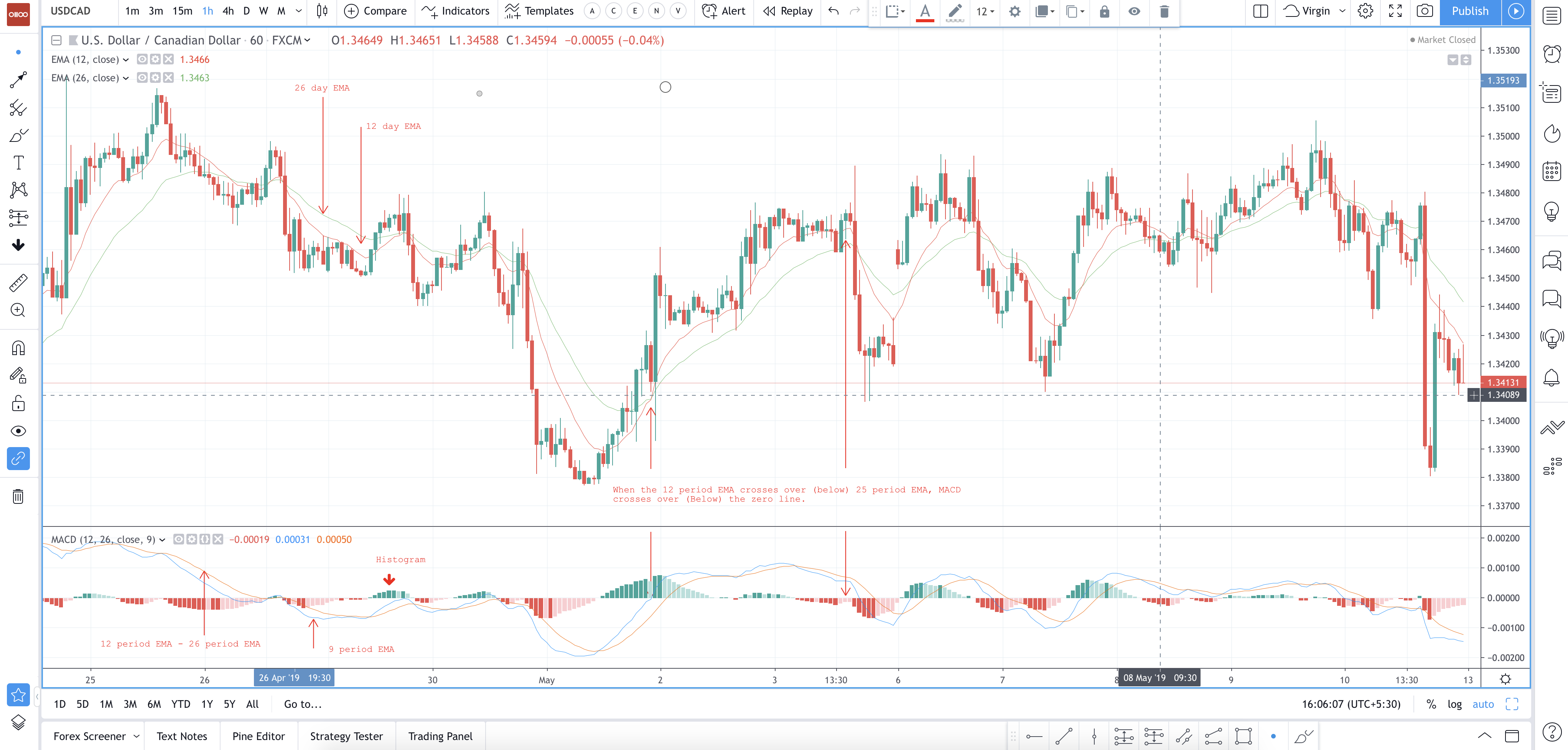
Chart 8 USDCAD 1h With the MACD Study - Click on the image to enlarge - Courtesy: tradingview.com
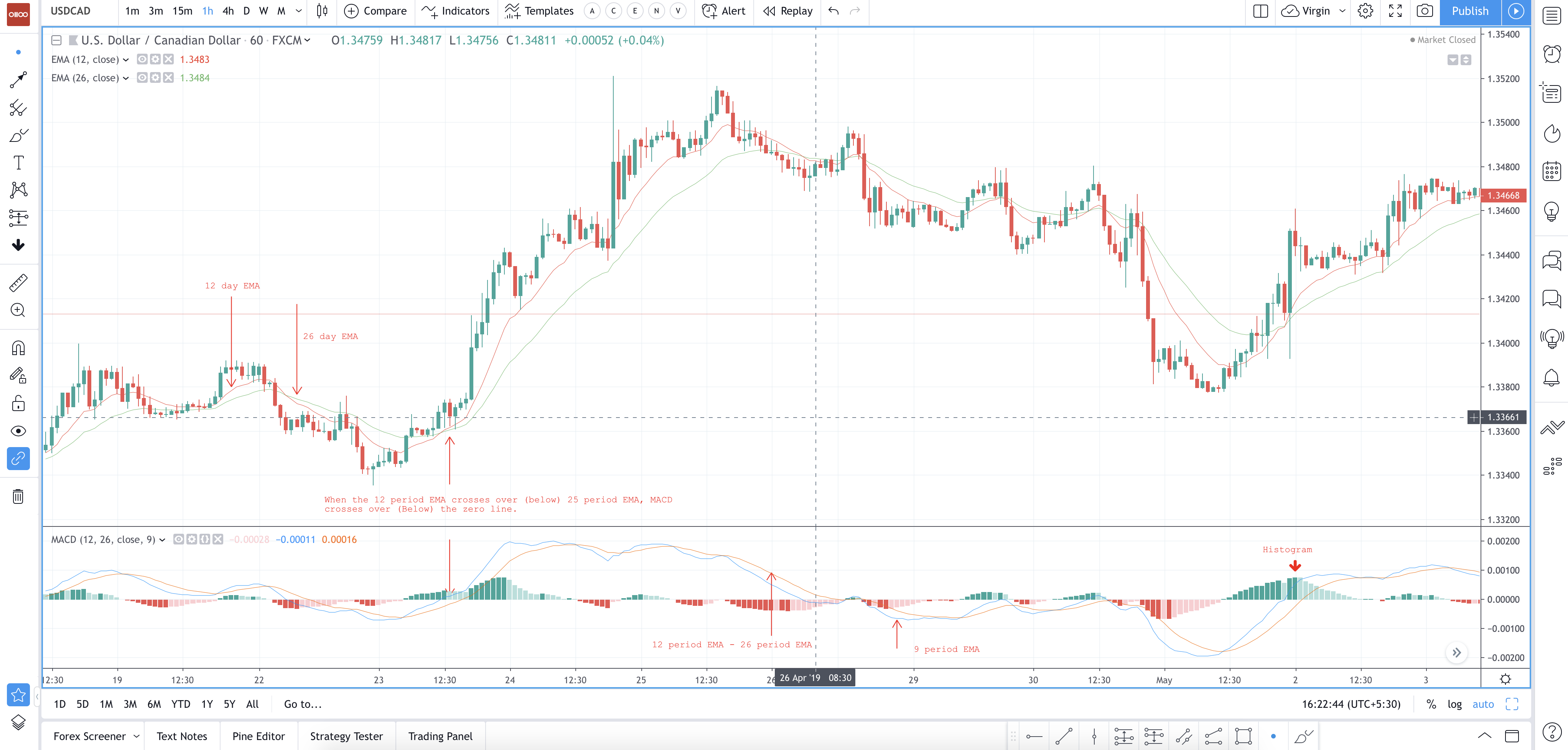
Chart 9 - USDCAD With the MACD - Click on the image to enlarge - Courtesy: tradingview.com
From the example above we Observe:
• MACD line (blue line): Is the difference between 12 and 26-period EMAs
• Signal (Orange line): Is a 9-period EMA of the blue line
• Histogram (bar graph): Is the difference between the blue and orange lines
Positive Divergence and Negative Divergence:
Divergence refers to a difference between the MACD line and the graph of the price. The positive divergence between the MACD and the price rises when the price hits a new low, but the MACD doesn’t. This is interpreted as bullish and suggests that the downtrend may be almost over. We saw it as a Negative divergence when the USD price hits a new high, but the MACD does not. This is interpreted as bearish and suggests that recent price increases will not continue.
Divergence may also occur between the USD price and the histogram. If new high price levels are not followed by new high histogram levels, it is considered as bearish, and if new low price levels are not confirmed by new low histogram levels, it is regarded as bullish.
Example Buy and Sell:
A bearish divergence occurs when a technical analysis indicator is suggesting that a price should be going down, but the price of the USD is continuing to maintain its current uptrend.
A bullish divergence occurs when the indicator is indicating that price should be bottoming and heading higher, but the actual price action is continuing downward.
The Bottom Line (When to Buy & when to sell)
The MACD shows the relationship between the two moving averages. If you see the MA’s and MACD are moving equally then, you can say that USD shall be making HH’s and LL’s. When you see that MACD and your plotted MA’s on the chart are performing or showing differently, then you have to understand that there is a divergence in the market and you have to be aware of it.
The MACD doesn’t give you Buy/Sell signal as standalone you have to use other indicators to check how the market is behaving, check for supports and resistances and then confirm that your analysis is right or wrong by checking the MACD indicator.
RSI (Relative Strength Indicator)
Relative Strength Index (RSI) which is popularly used by traders to get a technical indication for buy and sell signals in a sideways market, can easily be grasped. The use of this indicator in a trending market is more intricate. RSI can be used over the three types of market conditions, namely uptrend, downtrend and range-bound or sideways market.
The strength of this indicator lies in its use to calculate the velocity of the price movements. RSI, unlike other momentum indicators such as Stochastic that have wide variations even when there is no significant price movement, RSI is resistant to such drawback due to the way its value is calculated. In short, RSI values are affected by the number of days that the price closes up and the number of days that the price closes down over a certain period “t”. Commonly used periods for t are 14 and 21 days.
Technical signals are obtained by setting two levels, typically a high level at 70 and a low level at 30 where RSI above the 70 levels is considered an overbought condition while RSI below 30 is considered oversold condition. In cases where the price of the stock is trending upward or downward, the overbought and oversold levels have to be changed. This is because RSI being an oscillator that moves between 0 and 100 will stay high in an up-trending market as there are consistently more days where prices go up as compared to days when prices go down.
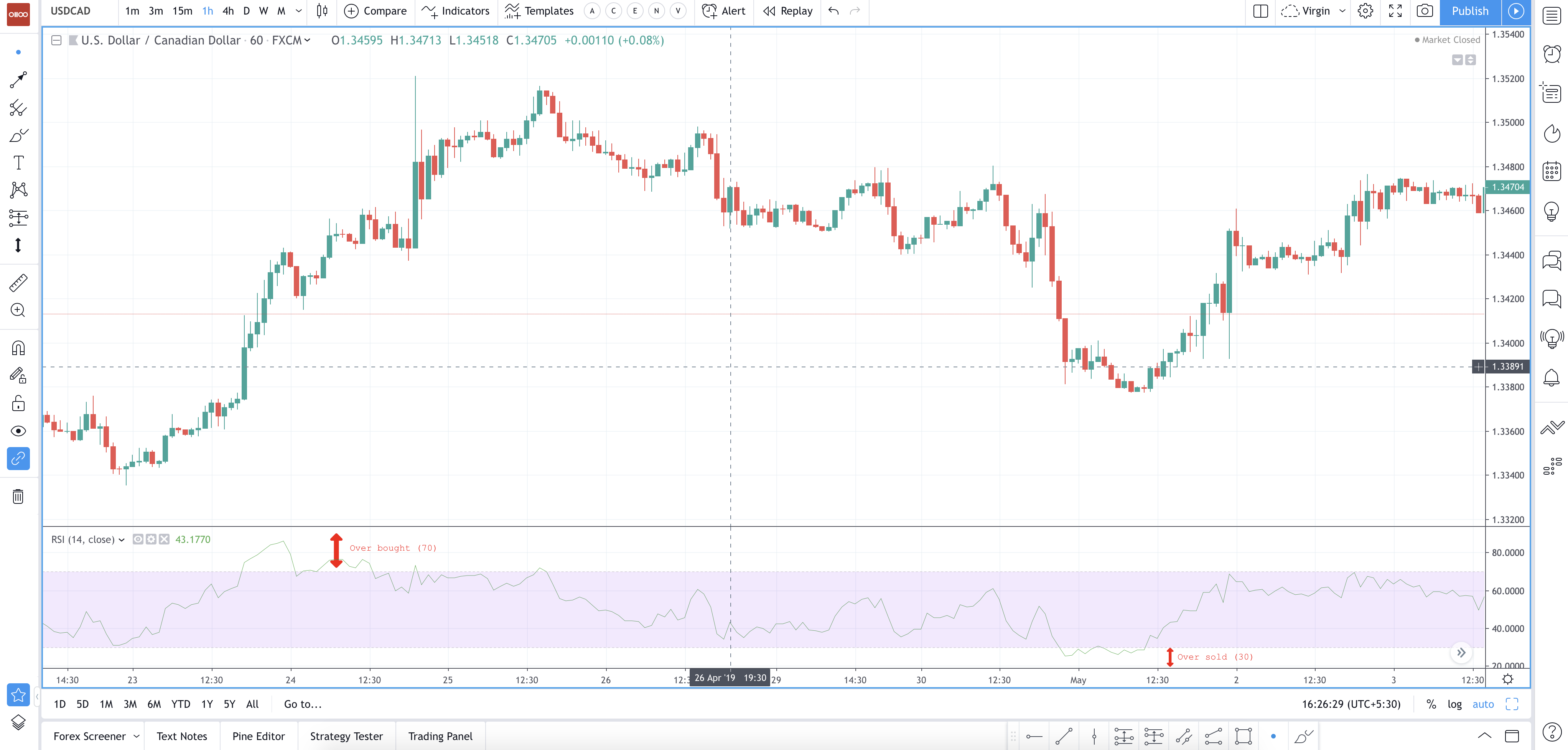
Chart 10 - USDCAD With the RSI Study Click on the image to enlarge - Courtesy: tradingview.com
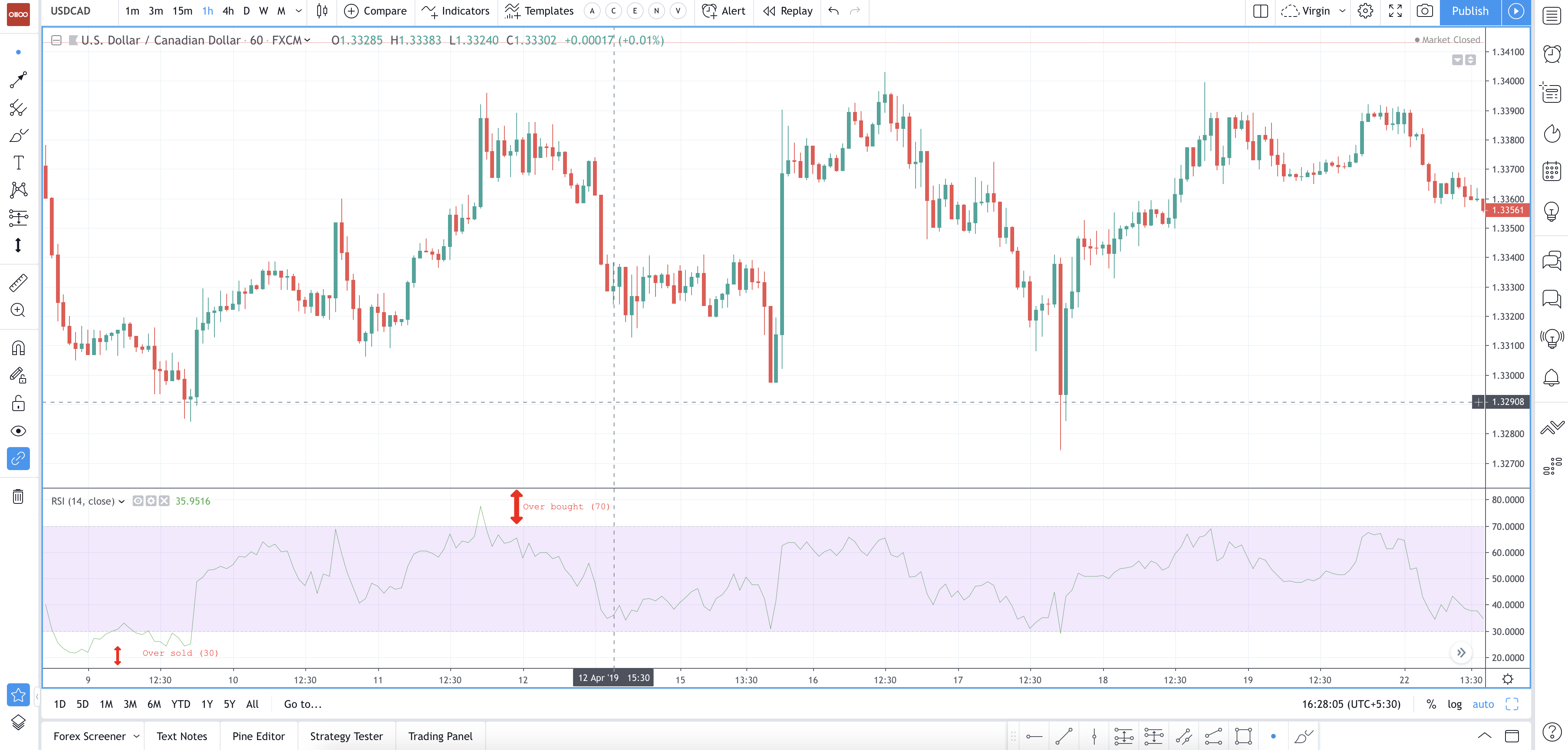
Chart 11 - USDCAD With the RSI Study Click on the image to enlarge - Courtesy: tradingview.com
Divergence
The divergence between RSI and price action is a solid indication that a market turning point is approaching. A bearish divergence is observed when price makes a new high, but the RSI makes a lower high. A bullish is observed when price makes a new low, but RSI makes a higher low.
Bearish divergence is a sign confirming an uptrend & Bullish divergence is a sign confirming a downtrend.
RSI Negative Divergence and RSI Positive Divergence:
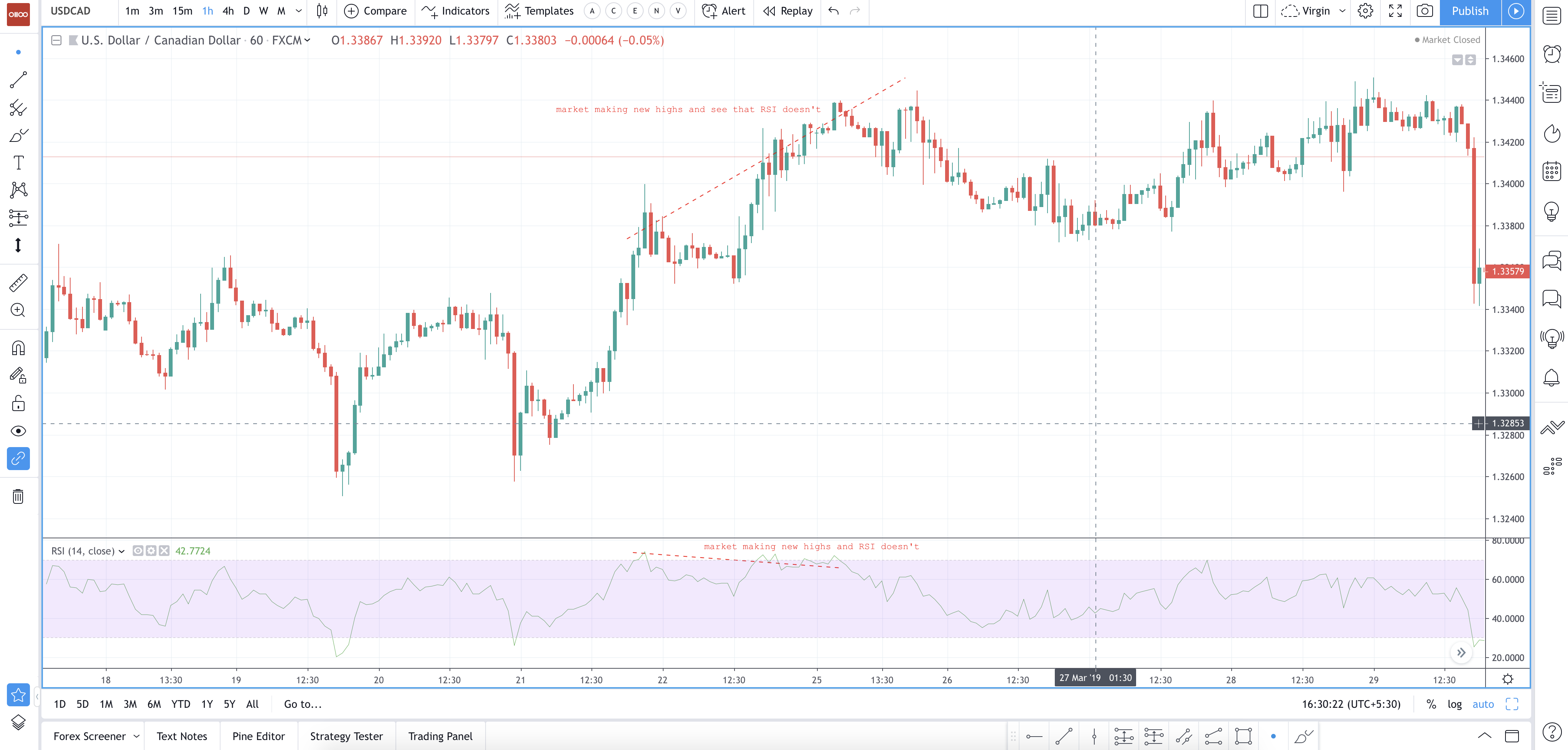
Chart 12 - USDCAD With the RSI Divergence Study Click on the image to enlarge - Courtesy: tradingview.com
Example 2:
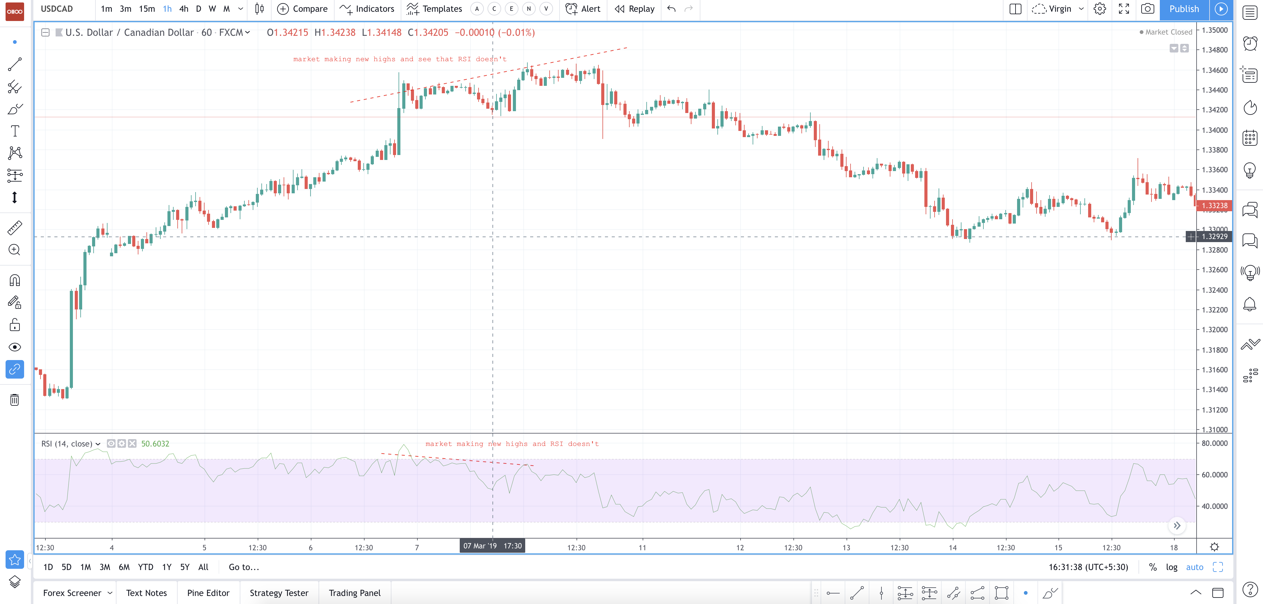
Chart 13 - USDCAD With the RSI Divergence Study - Click on the image to enlarge - Courtesy: tradingview.com
The above example explains the existence of positive and negative reversals in the RSI. Reversals are the opposite of divergence. A positive reversal occurs when the uptrend price correction results in a higher low compared to the last price correction. While RSI results in lower low compared to prior correction. A negative reversal happens when downtrend results in lower high compared to the last downtrend, but RSI makes a higher high as compared to the previous rally.
Despite stronger momentum, the price could not make a higher high or lower low. This is strong evidence to say that the main trend is about to resume. Positive reversals happen only in uptrends while negative reversals occur only in downtrends. Hence their existence confirms the trend.
The Bottom Line When to Buy or Sell and when to know that the market is reversing:
By using RSI, you can anticipate if you can buy or sell the currency. The best range to buy currency is when the RSI is below 70 and above 30. If RSI is showing above 70, then that is an indication of overbought, and you have to sell the USD if you are in a buy position. If the RSI is below the 30 levels, then you have to buy back the currency (USD) if you are in a sell position.
RSI can also act as support and resistance. The overbought area acts as a resistance level, and an oversold area can act as a support level. However, you can’t use this indicator as a standalone. You have to use other price action techniques in combination with RSI.
Example for Reversal (Shifting from buy side to the sell side):
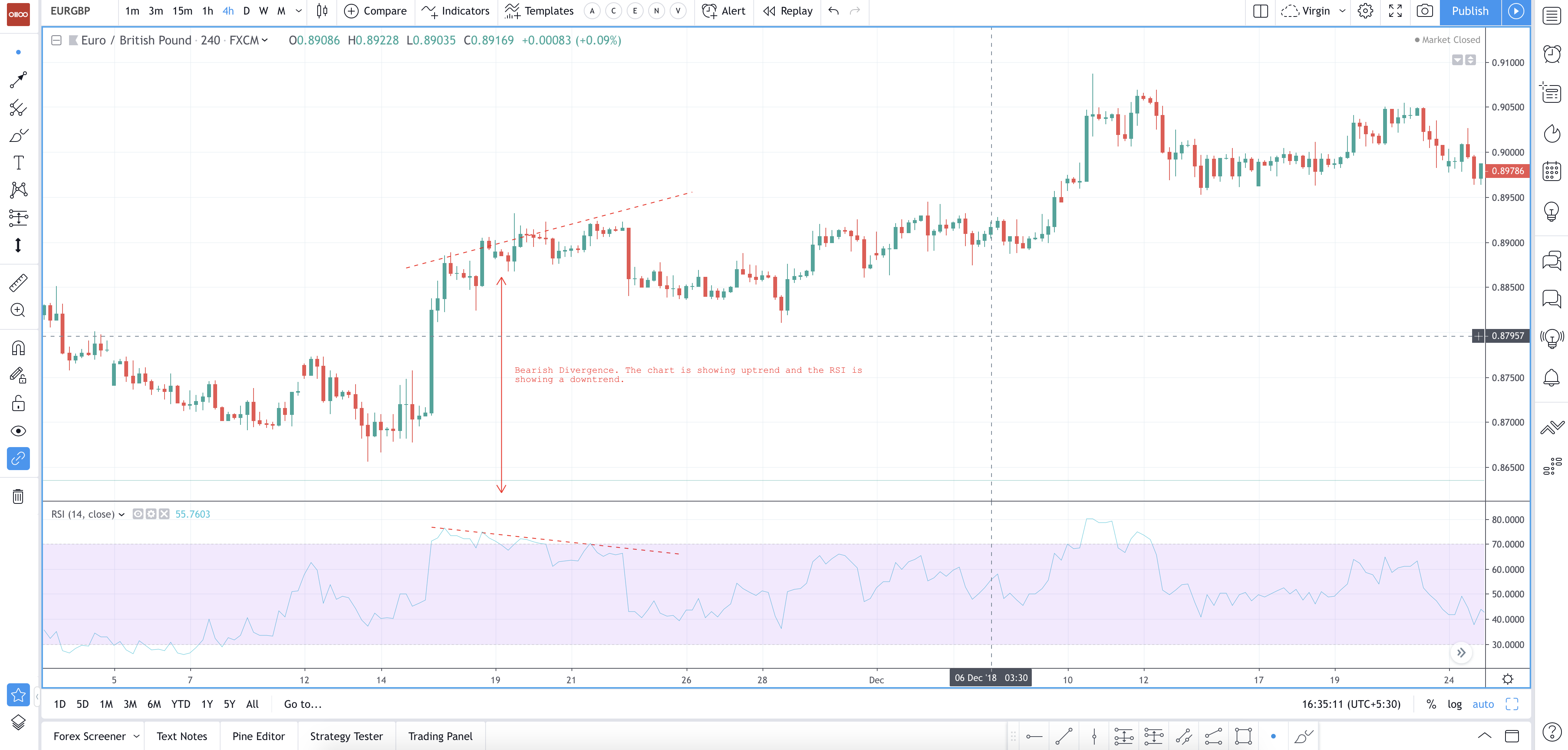
Chart 14 - USDCAD With the RSI Reversal Signal. - Click on the image to enlarge - Courtesy: tradingview.com
Overbought = Sell Signal
Oversold = Buy Signal
Divergence = Shift in the market (Reversal)
Commodity Channel Index (CCI)
The Commodity Channel Index since its inception has grown in popularity. These days it has been a common yet important tool for traders to identify cyclical trends not just in commodities but also in Forex Markets. CCI can be adjusted accordingly as per the time frame trader wishes to trade by changing the averaging period.
The CCI is evaluated as the difference between the typical price of a currency and its simple moving average, divided by the mean non-relative deviation of the typical price. The constant is set at 0.015 to ensure that ~ 70 to 80 per cent of CCI values would fall between -100 and +100.
The CCI fluctuates above and below zero. The % of CCI values that will lie between +100 and -100 will vary depending on the number of periods used during the analysis. A small CCI will be more volatile with a smaller % of values between +100 and -100. The greater periods used to calculate the CCI, the higher the % of values that fall between +100 and -100.
CCI Divergence
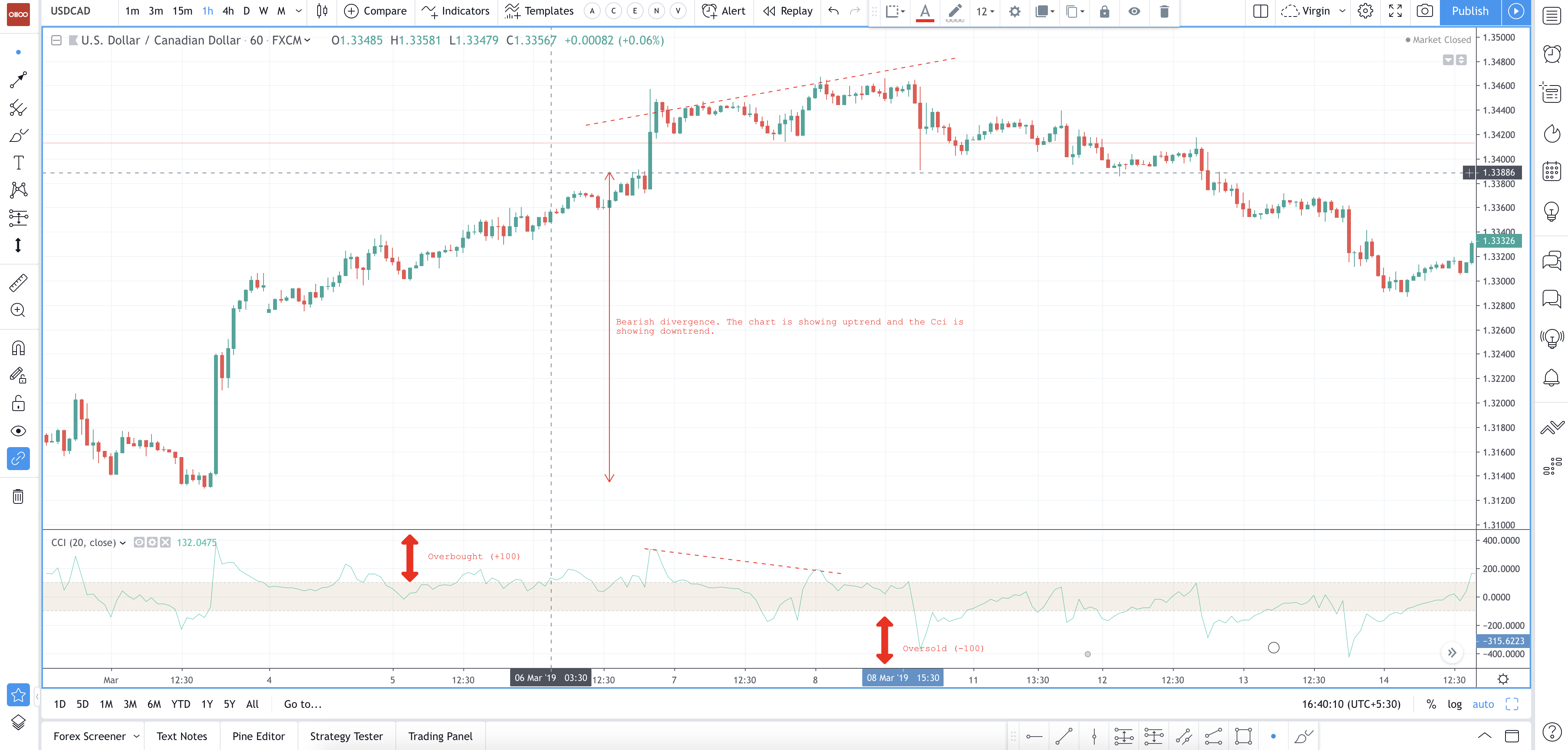
Chart 15 USDCAD 1h with CCI Divergence - Click on the image to enlarge - Courtesy: tradingview.com
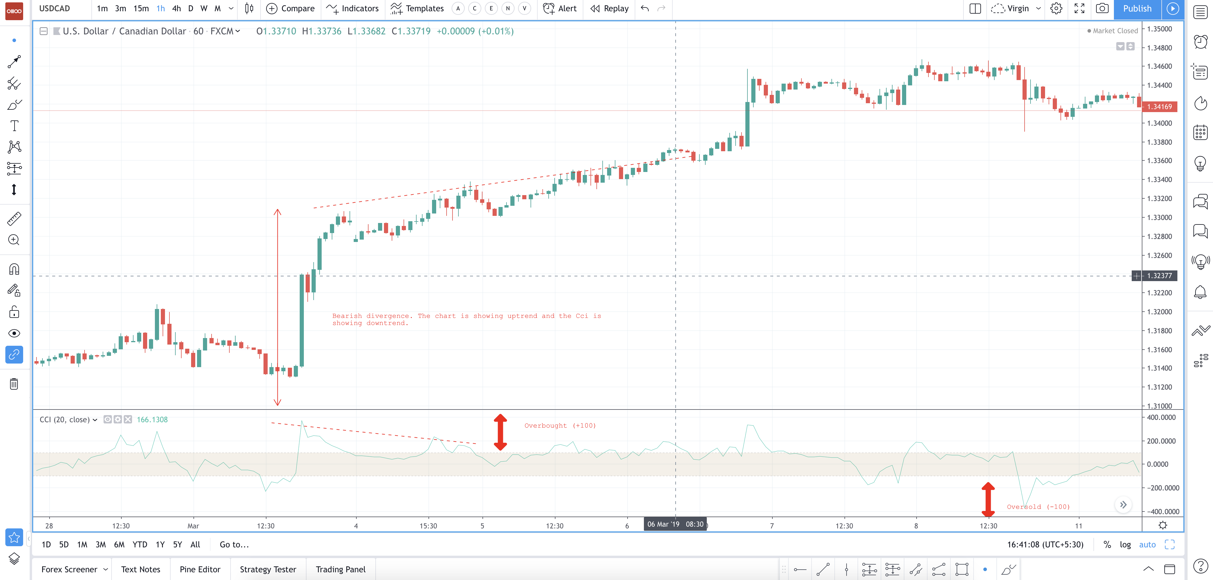
Chart 16 USDCAD 1h with CCI Divergence - Click on the image to enlarge - Courtesy: tradingview.com
Traders generally use the CCI to identify price reversals, price extremes, and trend strength. CCI should be combined with other aspects of technical analysis, just like we do for other indicators. CCI is put into the momentum category of oscillators. Along with momentum, volume indicators and price charts can influence the technical assessment. It is used for detecting divergences from price trends as an overbought or oversold indicator. We can draw patterns on it and trade according to those patterns.
With respect to this, it is kind of similar to Bollinger bands but presented as an indicator. Typically CCI swings back and forth above and below a zero line. Normal oscillations will happen within the range of +100 and -100. Readings above +100 imply an overbought condition whereas readings below -100 imply an oversold condition.
CCI, when combined with other oscillators, can be an extremely valuable tool to identify potential peaks and valleys in the price of an asset. This provides investors with reasonable evidence to analyze and forecast changes in the direction of the price movement of a currency.
The Bottom Line (When to Buy & Sell or Reverse)
Traders have found that the CCI is valuable for identifying reversals. CCI is an important indicator that is capable of producing a wide range of buy and sell signals.
Example for Sell Signal:
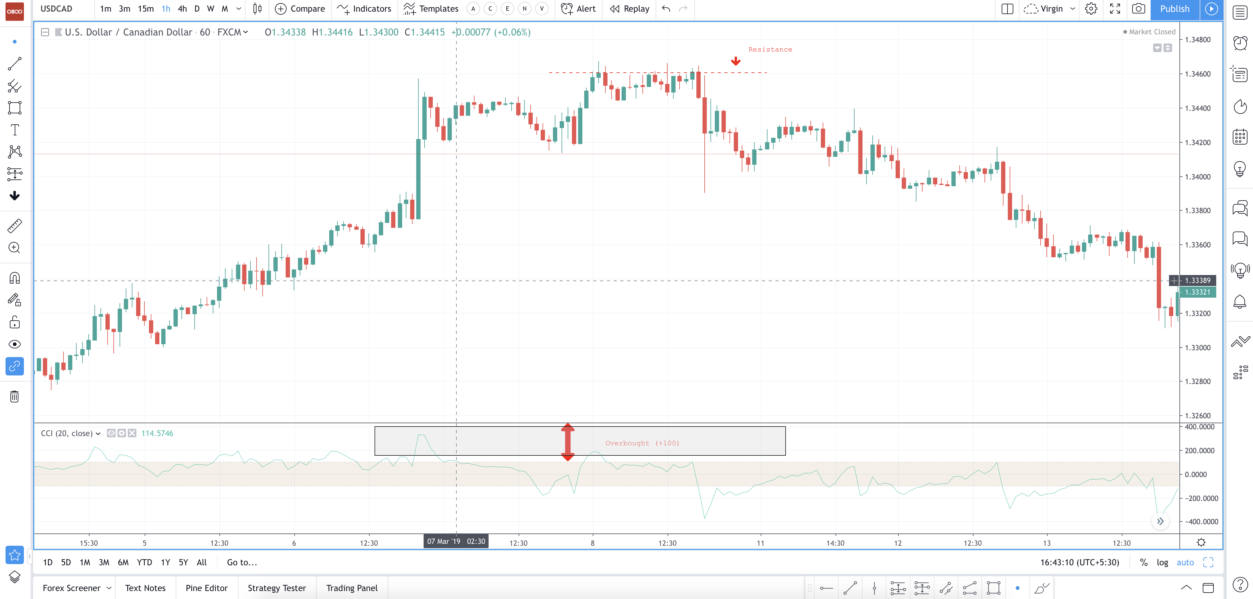
Chart 17 USDCAD 1h with CCI Sell Signal: - Click on the image to enlarge - Courtesy: tradingview.com
Example for Buy Signal:
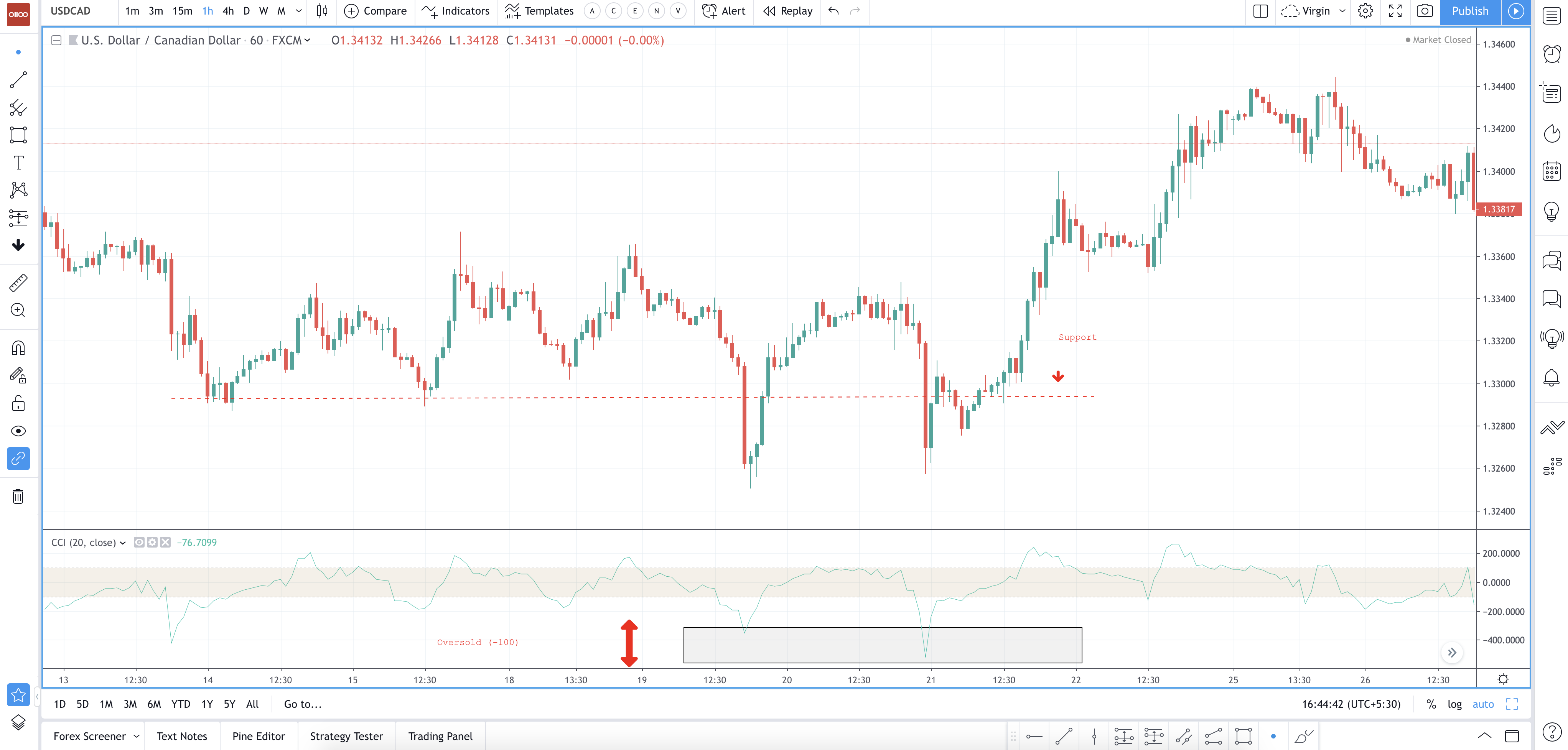
Chart 18 USDCAD 1h with CCI Buy Signal:- Click on the image to enlarge - Courtesy: tradingview.com
CCI can be used in identifying overbought and oversold levels. Any security would be considered oversold when the CCI dips below -100 and be considered overbought when it exceeds +100. A buy signal can be given from the oversold levels when the CCI moves back above -100.
From overbought levels, a sell signal can be given when the CCI moved back below +100. CCI can also act as a support and resistance (Overbought area acts as a resistance level and oversold area can act as a support level) but you can’t use this indicator as a standalone. You have to use other price action techniques in combination with CCI.
Overbought = Sell Signal
Oversold = Buy Signal
Divergence = Reversal
Volume
The term ‘Volume’ in capital markets refers to the total number of transactions of a particular currency that has happened in the market during a given period of time. The average volume is often reported as the average volume over a longer period of time, generally one to three months.
Any significant positive or negative news can affect the volume of a currency and it will usually deviate from its average volume. This means that more people are trading this currency. Higher volume for a currency is an indicator of higher liquidity.
When analyzing the volume, there are recommendations as to how we can determine the strength or weakness of a move. As traders, we are more likely to join strong moves and take no part in moves that show weakness or we may even watch for an entry in the opposite direction of a weak move.
Volume and Market Interest
A market is considered as rising when there is a rise in volume. The buyer’s participation should be on a rise and a lot of enthusiasm in order to keep pushing prices higher. An increase in the price and decrease in the volume shows that there is less interest and this is a warning of a strong reversal.
The price drop or rise on little volumes is not a strong signal. A price drop or rise on large volumes is a strong signal that something in the fundamentals of the currency has significantly changed.
Example Buy and Sell
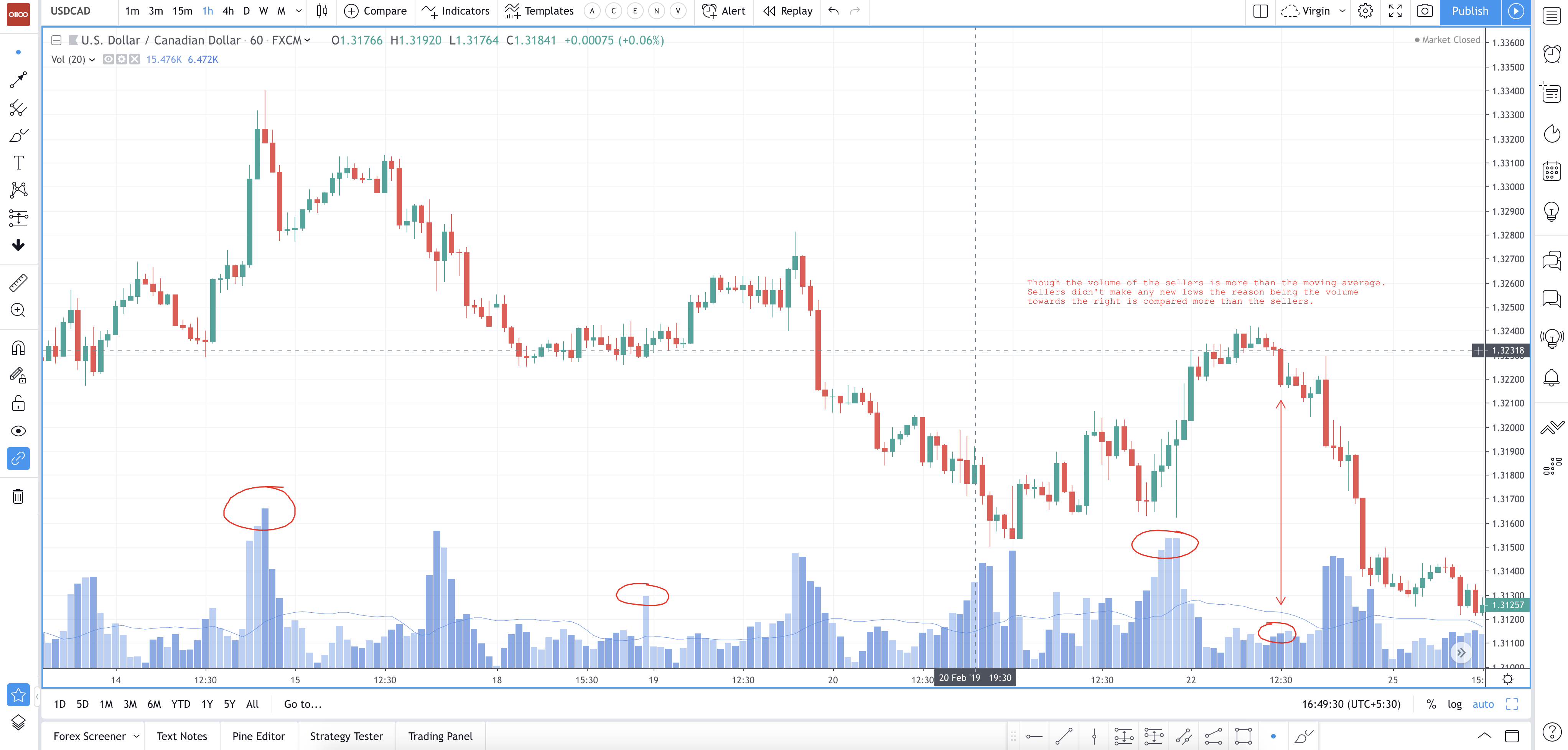
Chart 19 USDCAD 1h with Volume - Click on the image to enlarge - Courtesy: tradingview.com
Volumes can’t be used standalone. It should be combined with any of the indicators to determine the transactions that are happening during the price movements. The encircled regions indicate the high movement of price and also high transaction happening during the period of time. That gives us extra confirmation that the trade is desired to move in the intended direction.
You can ignore the trade if the price momentum is high and the volume is less compared to the previous volume (Above MA/Below MA). Above MA gives up more confirmation and below MA gives us less confirmation.
The Bottom Line (When to Buy & when to sell)
Volume with the momentum and candlestick patterns will give you much more additional information about the price when it is reaching the support/resistance level. High volume with high momentum will give you confirmation about doing a buy near the logical areas and vice versa.
Volumes are more helpful in trading stocks or commodities as they are based on a central exchange. But when it comes to currencies & cryptos, there might be several brokers who provide liquidity for the buyers and sellers.
Volumes might not be significant with Forex markets but you will have an idea on what % of buyers or sellers controlling the market within your broker.
