

This is part two of the MetaTrader 4 guide and it will be dedicated mainly to chart setups
Shortcuts wrapup
On the previous document, we reviewed the basic of the MT4 platform. Let’s go over the main issues:
Shortcuts are your best friend to save you time, mouse clicks and wrist efforts. Therefore I cannot stress enough the importance to get used to them.
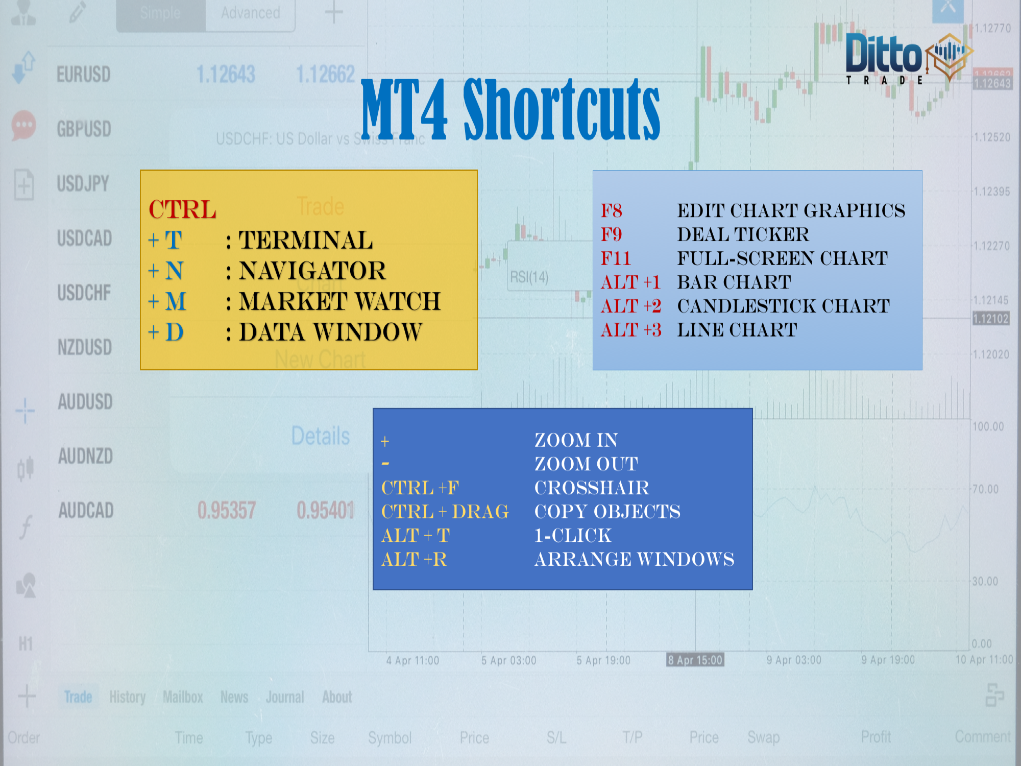
Ctrl-M, Ctrl +N andCTRL+T for turning on and off the Market watch, Navigator and Terminal
Ctrl O, calls the Options window. We should make sure the select objects with one click is checked, to speed up our job.
(+) zooms the chart in. (-) zooms it out
Ctrl +drag copy objects
Ctrl +F asks for the crosshair
Alt +T 1-click trading
F9 for the trade window
F8 calls the chart properties window
F11 will set the chart to full-screen mode
Now that we know how to navigate and find objects in our trading platform, let’s see how to create some chart analysis and, then, open a position.
As we said in part I, you don’t need to focus on all assets your broker offers. Really it’s impossible to concentrate on all pairs and crosses, plus about 60 stocks, sixteen cryptos, and twelve indices, plus energy and metals. Therefore, you should organize your trading environment to let it focus on your particular interest.
There are several ways to open a new chart. The six majors are arranged and, then the rest of the categories are conveniently arranged in a button in the upper-left side of the platform window.
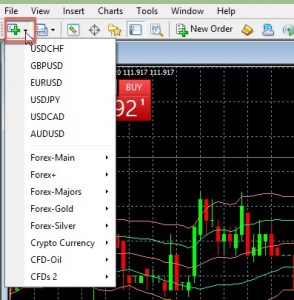
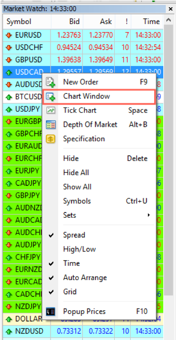
Going to the Market watch and right-clicking on the asset and choose Chart window, is also a handy way to do it.
Clicking and dragging the pair into an empty area of the chart window will do it also. The chart will show the Default template. Therefore, as we said in the first article, we should set the default template with our favourite setup.
Clicking and dragging the pair into another chart will change the asset the chart is showing. Here, the chart template doesn’t change.
Arranging the charts
You can arrange them by pressing Alt +R or click the auto-arrange button at the top and have it presented at the same time, tiled in small windows.
When we need to just focus on one chart we maximise it by double-clicking the upper bar of the chart we want to analyse.
Then, if we press Ctrl F6, we can cycle through our set of charts, in the order that is defined in the market watch.
If you had followed the steps discussed in the first part, you already have a Default template, so every new chart you make will have your favourite format.
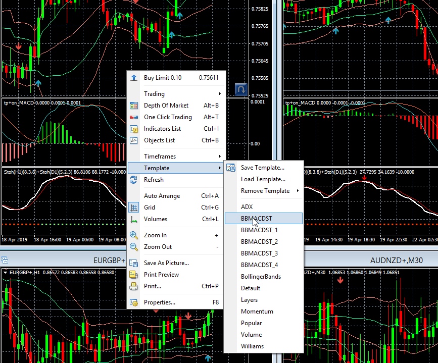
You can switch between templates, by right-click -> template -> and choose another one from your template list. (Don’t forget to save first your work, because it will be wiped out by the new template, Therefore, if you’ve already worked for weeks in your analysis, I don’t see any reason to switch to another template, but in case you need to do it, save your work first.
Other options
If we hit Ctrl + F8, we get the properties window, which has two tabs. The first one is already known, the second tab called Common allows setting other options.
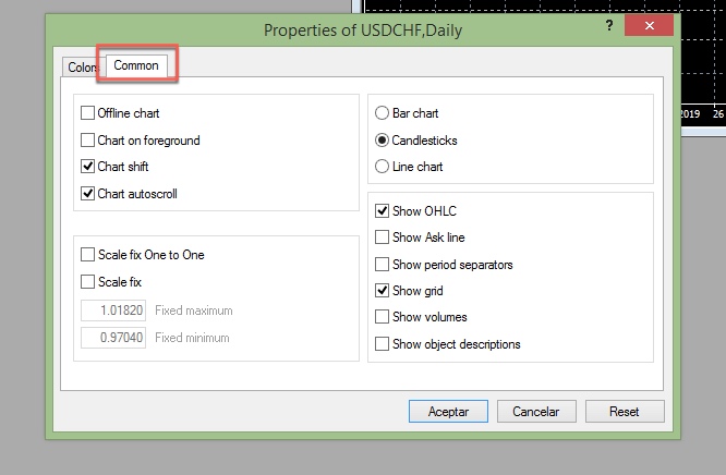
The chart shift gives us space to the right which is very handy for analysis, the auto-scroll moves the chart to the left every time a new bar or candle appears.
On the right part, we can choose between three chart types: Bar, Candlestick and Line chart.
Bar charts were devised in the west by technical analysts and show the price of a period, here, for example, there is a 1-hour chart. Every bar is one hour of activity. There are four main levels on every bar: The Open, the High the Low and the Close: OHLC.
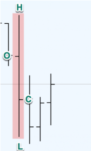
Chart 1 anatomy of a Bar
From Japan, we imported the candlesticks.
A candlestick is a different way to present the same information present of a bar. It uses the Open, High, Low and Close of a bar to construct a figure that resembles a candle stick. Candlesticks were widely used in Japan since a hundred years ago but mostly ignored in western countries.
A candlestick bar consists of a body part from open to close and
two “shadows” outside the body, up to the High and down to the Low price levels.
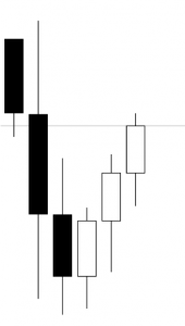
Chart 2 Candlestick bars
The traditional candle style was an empty body on the ascending candles and a black body on the descending candles. That was because charts were pencil-drawn on paper. With the advent of personal computers, charting software allows filling the body of a rising candle with any colour and the falling candle with another one ( usually red).
This candlestick segment shows the same period of the bar segment above, but a lot more information is visualised at a glance. We see that there are three downward periods of price action and, also, three upward periods. We can deduct that from the bar chart, but we need to make a deductive effort. On the candlestick chart, it’s evident, as we can see.
Other chart options are,
Show the ask line, to observe the distance or spread between the bid and ask.
Show period separators will show/ hide a vertical separator. on intra-day timeframes, it will show daily segments, on daily timeframes it will show weekly segments and so on. That can be more easily performed using Ctrl +Y.
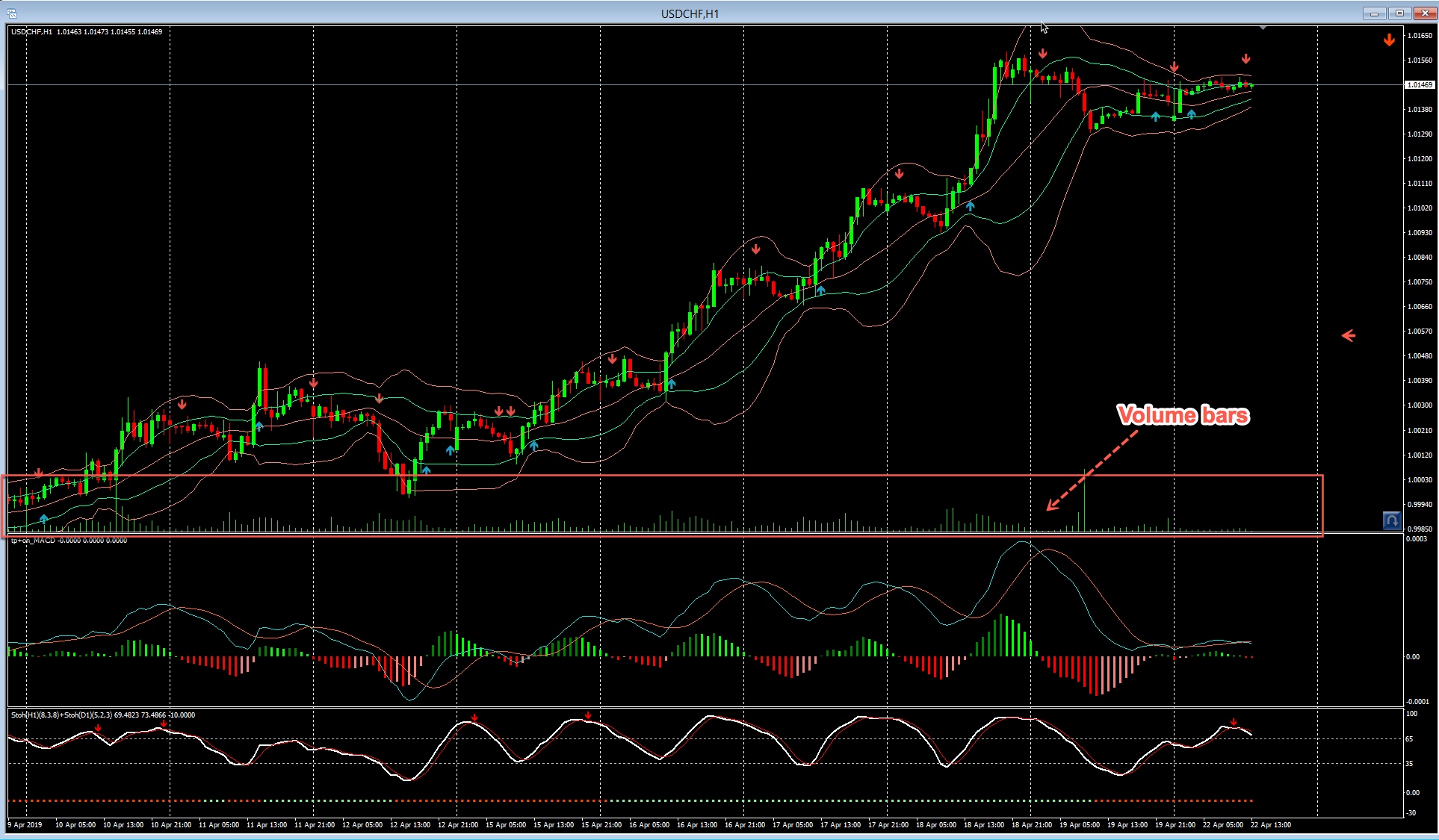
Show Volumes: Will shows volume bars at the bottom of the main chart. You can do it faster with Ctrl + L
Adding Indicators
Once we have set up the basic chart format, we usually want to add some indicators.
The slow way to do it is by going to Menu -> insert-Indicators—and follow the sub-menus until we find the right indicator
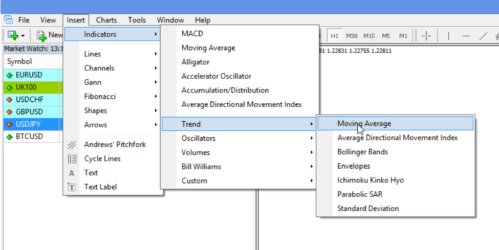
In part one of this guide, we have shown better ways. The first improvement is to populate a favourites bag with our common ones. Another improvement is, as we said, to attach a hotkey to every one of those favourite objects.
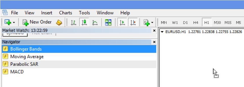
If you use the navigator’s Favorites tab, to add an indicator you just need to drag it to your chart
To add, for instance, a 20-period simple moving average we drag it, and a window appears where we can change its parameters. We set Period to 20, and let its colour to red, but change the width of the line to make it thicker.
Adding any other study is similar.
Arranging several charts
As we already saw before, If we have several charts, we can arrange them by pressing Alt +R or going to the tile button and click on it. If for some reason, we minimize one or several, we can hit Alt +R again, and they will be arranged using all the available space for the un-minimized charts.
Let’s say we want multiple timeframe configurations. We drag the chart in question several times and then vertically arrange them and set a different timeframe for each of the charts.
Profiles
A profile is a chart setup and configuration. For instance, the one we have on the video sample. This video sample corresponds to a multi-timeframe set-up od the Nasdaq-100 CFD.
That profile can be saved using the File->”Save As…”menu. I kept it as NASDAQ-100. We can retrieve it using the same actions and click NASDAQ-100.
If you’re following several assets using a multi-timeframe strategy, once you’ve saved your model setup, you can retrieve it several times, populate it with another asset of your list and save it using the asset name as is shown in the video.
That way, you can build several profiles for different purposes or assets, and you can switch from profiles very easily and fast. The Use of Ctrl + F5 switches between profiles. If you organize your profiles classified by assets or asset classes, you may switch between them very fast.
At the bottom of your chart, the status bar shows the current profile in use. You could click on the name, and the list of available profiles shows up, and there you can also choose another profile.
Finding trends
The purpose of the chart analysis is trying to find right trading spots. One of the trading maxims is that the trend is your friend. Therefore, the trader’s first objective is identifying trends and price channels.
To identify a trend, the chart analyst has several tools at his disposal. One of them is the trend line.
To draw a trend line on a downward price movement such as this one, we have to draw a line connecting the high turning points of the price pattern.
Inserting lines
Now that we have set object selection to one click, we can manage drawing lines much better. Let’s draw support and horizontal resistance lines.
Supports are located where prices have reversed from a downtrend, while resistances are levels that were past points Where price reversed to the downside.
Past supports become resistances and vice-versa. We want to spot those levels because they are potential zones of future reversals as well.
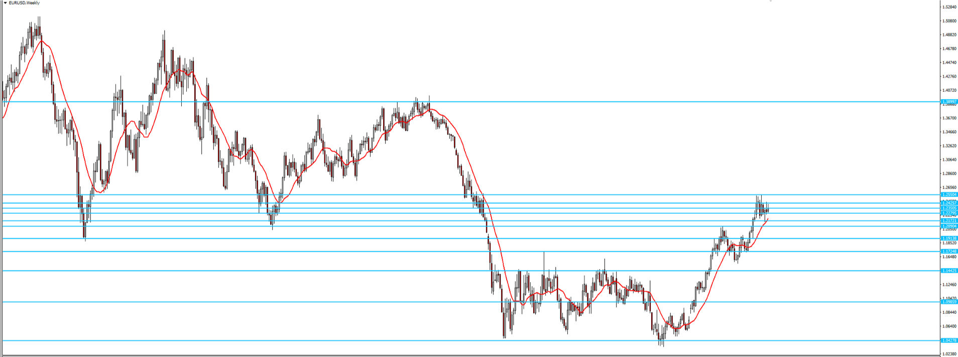
Let’s draw some of them. First, we zoom out a bit using the fast hotkey minus and set our timeframe on the weekly chart. Now, there are two ways to draw resistance and support lines. The first one is to look for the lows and the other one for the closes. We don’t care too much because that is a zone, not a line.
The first way to do that is by using the horizontal line.
Now that we have set one, we can copy it, by clicking it to select it and using Ctrl +drag to drag a new line. That is much faster than moving the cursor up to click a new horizontal line again.
If we switch timeframes, we observe that the horizontal lines are visible there, as well. There are two things we must learn to keep those lines under control. The first one is deciding on which timeframes we want them to be visible.
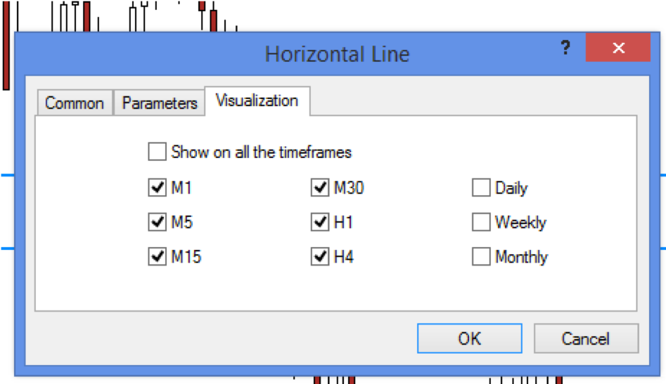
Of course, we would like to see longer timeframe lines visible in shorter timeframes, but not always is right in the opposite direction. Usually, we don’t want the shorter timeframe supports and resistances to be visible in longer timeframes, because, if we add up those lines starting from hourly charts up to weekly charts we will end up like this:
An uncoloured mix of four different timeframes.
To avoid that, we will, first, define where those lines will be visible, and second, establish a colour code for lines of different timeframes.
For example, dark blue for monthly lines, light blue for the weeklies, violet for dailies, red on four-hour lines and light-green on one-hour charts.
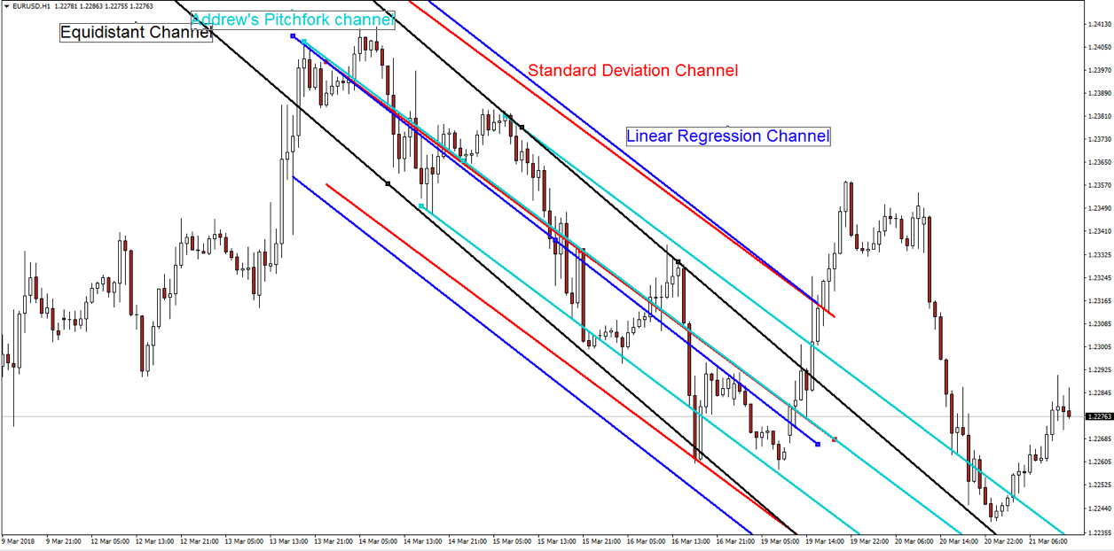
Other objects can be set up in the same way. Let’s add a trend line. Now by selecting it with one click and control drag it, we create a parallel to this one, so we have made a trend channel.
There are, also, dedicated objects to construct trend channels. One of them is the standard deviation channel. Right-clicking on the mid-line we get the properties window, and there we can set the parameter to the desired standard deviation. Here it’s one.
The other method is the linear regression channel. It’s not as malleable as the standard deviation object, but it’s quite good at pointing the right trend direction. In this case, the channel has a bullish bias.
The third object is Andrew’s pitchfork lines. To set the channel direction, we click first on a central point, then at a low and high point, and that is it. As we see, the channel bias is not drawn in the same way as the previous methods. The issue is that, if you try to construct a pitchfork trend channel several times, you won’t get the same channel.
The fourth object is the equidistant channel, but that I find it less handy than doing the same using the copy and drag of a trend line.
The Fibonacci Retracement Tool
Another handy tool is the Fibonacci retracement tool, Although the first thing we recommend to do is changing its colour. Let’s change it to some dark colour, such as this dark green.
You can change its properties by clicking on the dotted red line and, then, right-click on it again and selecting Fibo properties…
On the Fibo properties window, we will change the style to some blue tone or some other colour that shows better on a white background. We will also change its thickness to the second line.
While, at it, we may erase some undesired values, such as 423.6, 262.8. Also, 50% which is not a Fibonacci level and, even 23.6. That got us a less cluttered Fibonacci retracement tool.
While this object is selected, we can drag it anywhere in our chart by touch and click the central red square.
If we measure a retracement from a top, we set the initial point at the start of the upward leg and the upper line to that top. By moving the square horizontally, we can increment or decrement the length of the horizontal lines.
If we want to measure a retracement from a bottom, we place the upper (0.0) line in the top, and click and drag the lower square to the downside, down to the latest bottom.
One handy trick is to make this indicator to show not only the Fibonacci numbers but also the price levels at which they happen.
To do this we open the properties window and write in the description %$, after the with four spaces as separation to make it clearer, %$ as here:
One final note, if you, for some reason need to go back to the Fibo factory levels, you just need to click on the Defaults button.
Another excellent tool we can make using this Fibo tool is a RiskReward calculator for our trades. The tool can be created by custom setting the Fibo levels (click on the image to enlarge):
  0 = Stop Loss
100 = Entry price
200 = +1
300 = +2
400 = +3 and so on.
Note: use the %$ at the end of the descriptive +n to show
the price level.
Unhappily, there is no way to save different versions of the fibo-tool. That said, it is rather easy to switch between different versions. We just need to copy by Ctrl + drag the version we want and copy it and adapt it to another location. Therefore, If we make this tool at the beginning of our chart analysis, we can use it multiple times, and if we need another version with different levels, we just copy it from another place or just press defaults into the button at the properties window and proceed from the base version.
On this figure, we show a long trade risk-reward calculator, but it can be used as a short trade calculator by just flipping the stop and entry lines(click on it to maximize).
Drawing zones or areas of interest
I’ve included the rectangle as a handy tool to draw areas, not only levels, of support and resistance.
By clicking on it once, near its centre, we select the object. Double click on it and its properties window appear. If the object was already selected, we just right click near its central point or on any of the edges, and we also get its properties window.
On the common tab, we can change its name, add a description and change its colour.
When drawing these bands, we can see the price channel from the perspective of oversold and overbought areas, and better plan our trades.
Order Entry Method 1
The trade window
There are several ways to enter a trade. Let’s start with the trade window. If we hit F9 or click the New Order button below the main menu bar, a trade window pops up.
This is a highly flexible way to enter a trade because we have a lot of choices at our disposal.
There are several parts to it. The left side shows a tick chart with bid and asks prices. The right side shows several fields.
There is a Volume field where you decide your position size.
There is a take profit box where you define your target level to close your position.
There is a Type of order: You might choose between Market execution, that is a market order to buy immediately, and a Pending order.
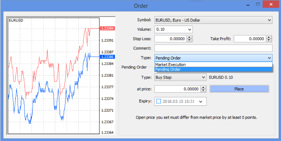
There are two types of pending orders: stop orders and limit orders.
Stop orders are orders that will be triggered if the price surpasses the level or touches it. That means that the level of a buy stop order must be higher than the current price and the sell-short stop order must be below the current price.
A buy limit order is an order to buy if price retraces to the level that is set by the limit order. Therefore, that level must be below the current price level.
A sell limit order is an order to sell-short if the price retraces up to the level set by the limit sell. Therefore the limit level shall be placed above the current market price.
Let’s suppose that we wanted to enter the trade setup of the figure below.
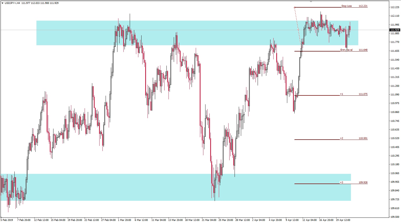
Basically, we want to go short if the price falls to 111.648, and we think that it the price moves above 112.221 our setup is invalidated, so this will be our stop loss.
Our take profit target might be one of those levels that are marked by the horizontal lines +1, +2, +3 and +4, which are our reward to risk (RR) ratio levels.
Type field: This is a short position in the euro, and we don’t want to enter right away ( called Market execution) but when the price touches 1.23495 level. Therefore, we would need to set a pending order, and conditional, with the type: buy Stop. That is done changing the Type field.
Symbol: When we hit F9 or click the New Order button the symbol that appears correspond to the current chart, but clicking on the field arrow we can select another asset. Usually, that is improbable.
Volume: There we define our trade size. 1 means 1 lot which in this case correspond to 100.000 euro. We can change that by double click and set other quantities. If you’re using a small-sized account or are testing a new strategy, you may start using mini or micro lots.
One mini-lot is one-tenth of a lot, or 0.1; one micro-lot is one-hundredth of a lot or 0.01 lot.
Stop loss Field: That will be your stop loss level. Your stop-loss is the level that invalidates your setup. In this case at 1.23304.
Take profit: Our target price to close our position with a profit. In this case, the most profitable situation is to close the trade at the +4 level (1.24258), which corresponds with a reward to risk(RR) of 4. A more conservative stance would be to set it at 1.24067, which is an RR close to 3.
At price: this is the field of your entry price. On this case, 1.23188
Expiry: If you let it unmarked, there is no expiry date. But you could set a time limit to your order, for example, to avoid a news event that might harm your plan.
Comment: This field allows you to write a comment or a more extended definition of your trade.
Once the order has been sent, we see these dotted lines on the screen which corresponds to the levels we set: The upper red line on is our target, the middle blue one is our entry point, and the lower red line is our stop.
Since the trade is not still executed, we are able to modify all of those lines by dragging them to other levels. If we do that, the Order window appears again and asks to modify or delete the order.
Order Entry Method 2
There’s another order entry method, maybe the most common entry method. It’s called One click trading and is activated by Alt +T, by right-clicking on a chart and select One-Click Trading, or by touching a little triangle at the top left of the chart.
When this functionality is activated, a square with a Buy and Sell boxes appear at the upper left of the screen.
This type of order is a direct order at the market, meaning it will fill at whatever price displayed at the moment it’s pressed.
The factory default for the trading size on this window is 1 lot. We have to be aware that when we change it, it does not remain changed forever. The next time the profile is called it will be back to 1 lot size.
Therefore, THE VERY FIRST thing you need to do is changing the default value to match your trading size and risk. That can be done with Ctrl+O -> Trade ->
After a trade has been filled, the usual dotted line appears on the chart. But we miss both stop loss and take profit. There is an easy way to create those two orders. To generate a stop-loss order on a long trade, we select the dotted line that shows the entry order and then drag it downward, down to the level we want our stop-loss level to be. We, of course, drag it upwards if we sent a short trade.
To create a take profit order on a long trade, we select the entry line, by clicking it and then drag it to the profit level desired.
Finally, to avoid moving pending orders by error, you may change this behaviour, by clicking Ctrl +O and access the options, accessing the charts tab and make sure Use Alt key to drag trade levels is checked.
